Melkweg
melkweg.nl/nl/Branding and website to appeal to a broad array of pop cultures

A venue for everyone
Melkweg is a venue for everyone. A sanctuary where you can be yourself. Open and accessible. They don’t like to be put in a box and so they program a variety of things. Diverse in style and culture – in addition to a stage for concerts and club nights, they also have an exhibition space, cinema and café Milk. And they are very outspoken about their mission to contribute to a creative and inclusive city.
That message should therefore be visible. Where many venues make themselves subordinate to the program – by showing a lot of images on the website of the shows on the website – the Melkweg chooses to sail its own course. We have started to sharpen this open and accessible story and make it visible with their new website. Therefor we worked on:
- branding that exudes creativity and inclusivity
- a website that shows the variety and lets you discover new things

A striking and flexible visual language
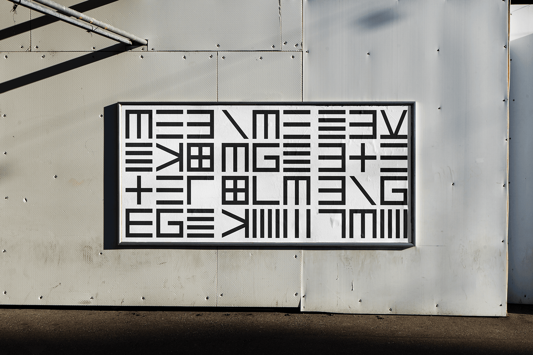
Creative, open, accessible, raw and with a do it yourself mentality. That’s Melkweg. And that is what the branding should convey. To meet this requirement, GRRR developed its own visual language in 2016 together with Bas Koopmans. The idea is simple, a font has been developed with the basic letters MELKWEG. The E turns into an M and the M turns into a W again. The letters are square blocks with which you can make a recognizable logo of every word.
A bold website where visitors love to spend time
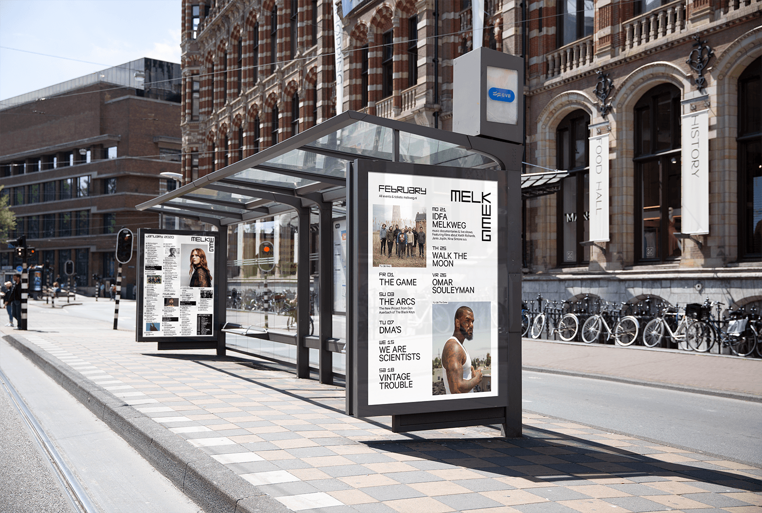
This visual language has been rock solid for years, but with the renewed positioning Melkweg wants to emphasize their open character even more. We emphasize this visually on the website with the use of color. The white background on the new website is a light and bright canvas. The content provides color and the diversity of artists and events pops off the page.
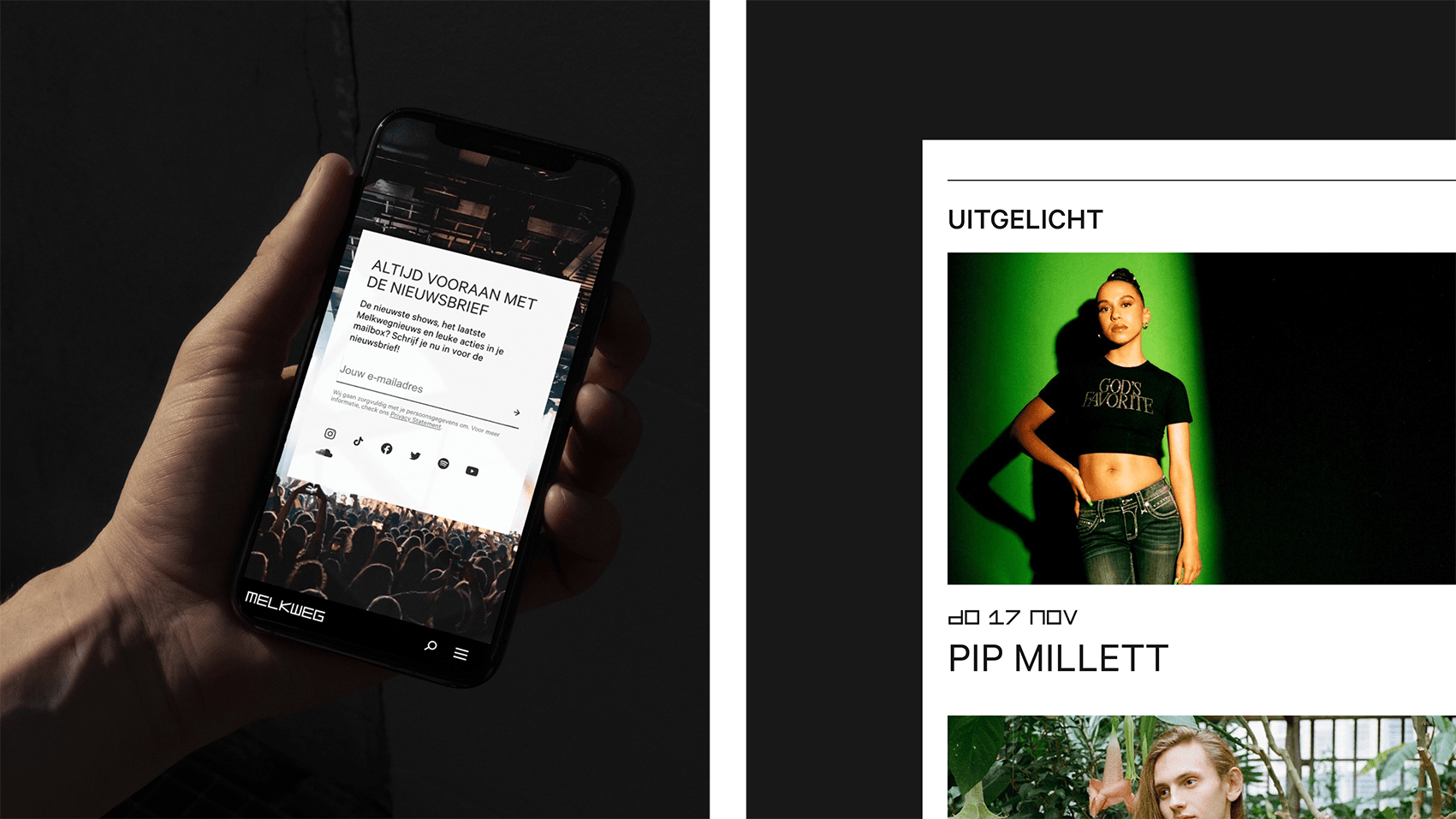
As a driver of creativity and diversity, it is important for Melkweg that visitors are inspired to discover new things. So the longer a visitor is on the website, the better. Based on the data from recent years – a nice advantage of a long collaboration – we know even better how we can inspire visitors. For example, we introduce loops – the short videos that you may also know from Spotify – to make visitors curious about acts they don’t know yet.
The homepage plays with the space and presents the variety of the program in an associative manner. No distinction is made between ‘big’ and ‘small’ artists, and the overview continues to refresh. So you get to see something new every visit. In addition to events, attention is also paid to themes, such as hip-hop or queer. In this way the visitor discovers new things, but it also contributes to the fact that people can find their community in the city. In this way, Melkweg becomes the cultural center where everyone can feel at home.
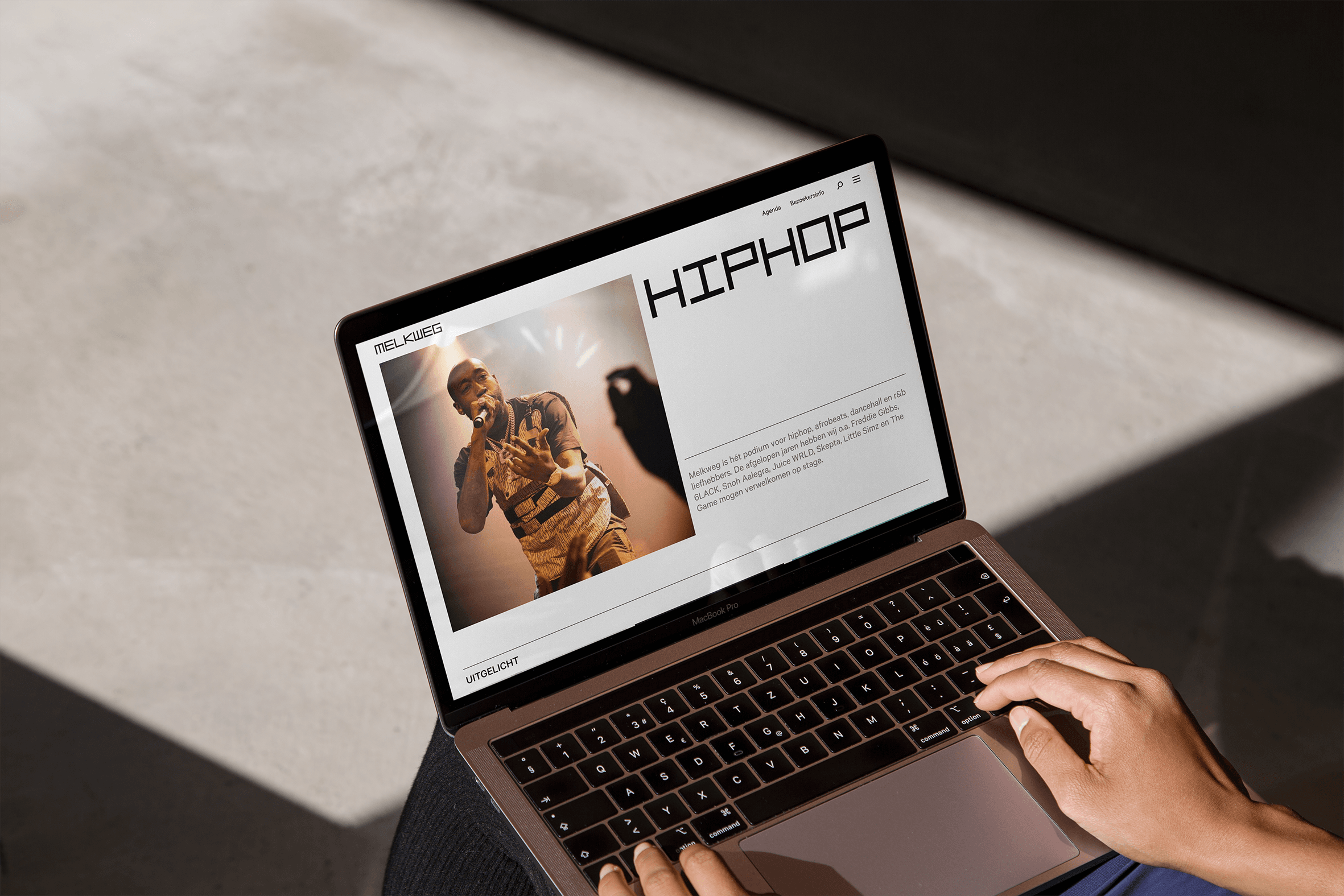
Broad programming, simply presented
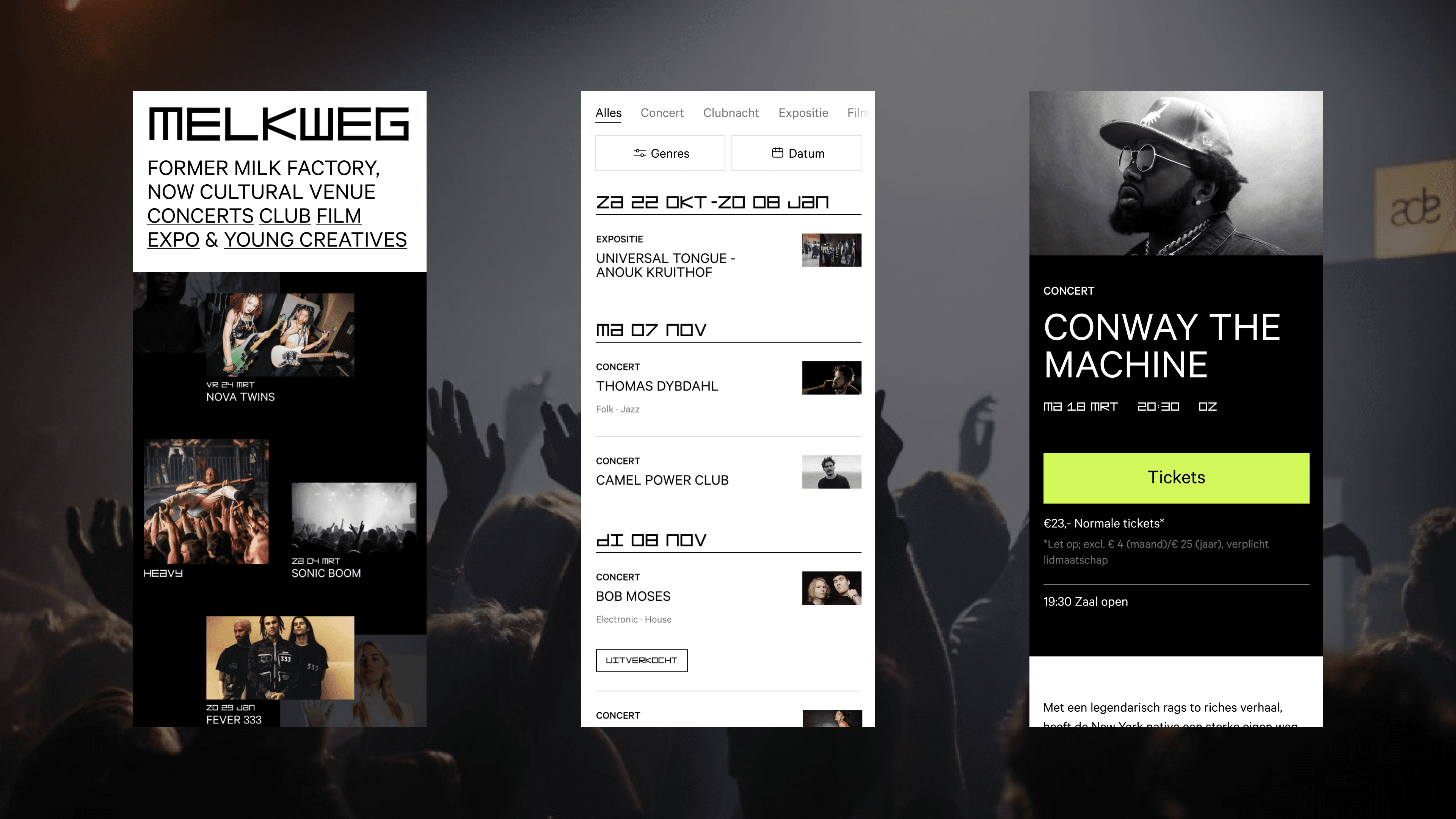
Melkweg offers pop culture across the board. From music to visual art and expo. That is why an agenda is not so easy to design. Some events last for weeks, or are part of a larger thematic line. Each type of program has its own content and structure. We designed various smart content formats that are dynamically built from our design system.
A smooth mobile-first website
Even though the style is quite raw, you want to offer the user a very good experience. On mobile ofcourse, because that is where the website is most visited. Smooth and fast transitions between the different pages are essential for this. Because websites that take too long to load a page don’t really invite you to swipe around. Quite a challenge with no less than 30,000 pages the Melkweg site has. But throwing off all those pages of past events is not very smart for your SEO.
By combining our years of experience with the latest, proven technologies, the Melkweg website is now lightning fast. That is not only nice for the visitor, but also for the marketing team of the Melkweg, because now deploying a page is a matter of minutes instead of hours. That’s fast – and therfor sustainable as well. Want to know more about the technical details? Read our blog Serving over 30,000 web pages blazingly fast.
- In progress
Cordaan
Making the complexity of modern healthcare accessible
