Rokin
rokin.amsterdamAmsterdam rediscovers Rokin
Placing Rokin back on the map of Amsterdam
Rokin is the best-known shopping street where you never go to. For over 10 years, the street and buildings have been thoroughly taken care of. The opening of the North-South line formed a great opportunity to re-engage Amsterdam with “the Dutch Champs-Élysées”. The cooperating entrepreneurs asked GRRR to develop a strategy to achieve just that.
We met two main challenges. First, the area has been a building pit for years (not so cosy!) and the area got known amongst locals as a tourist reserve. Second, due to an expanding city, the people of Amsterdam reside further and further away from the city center. And at the same time, the retail industry in the surrounding neighborhoods is improving.

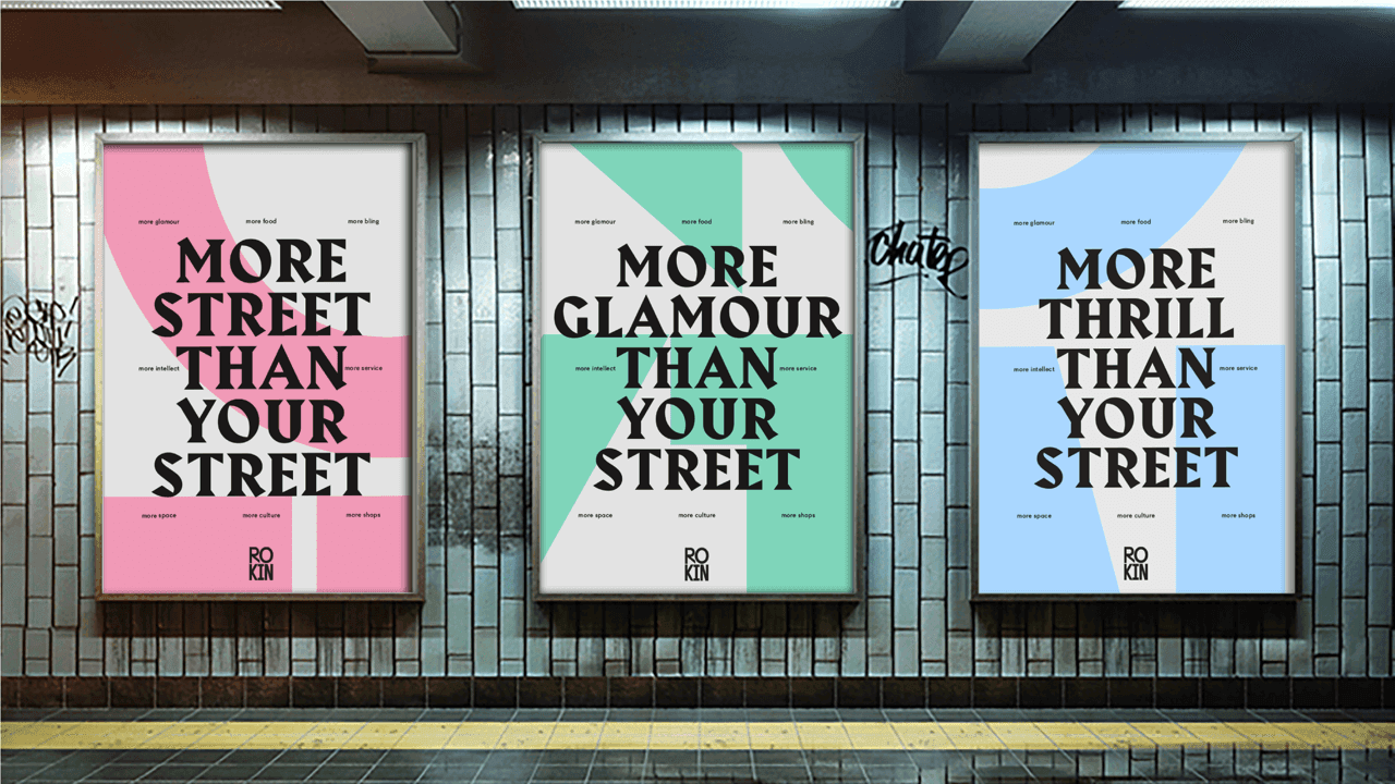
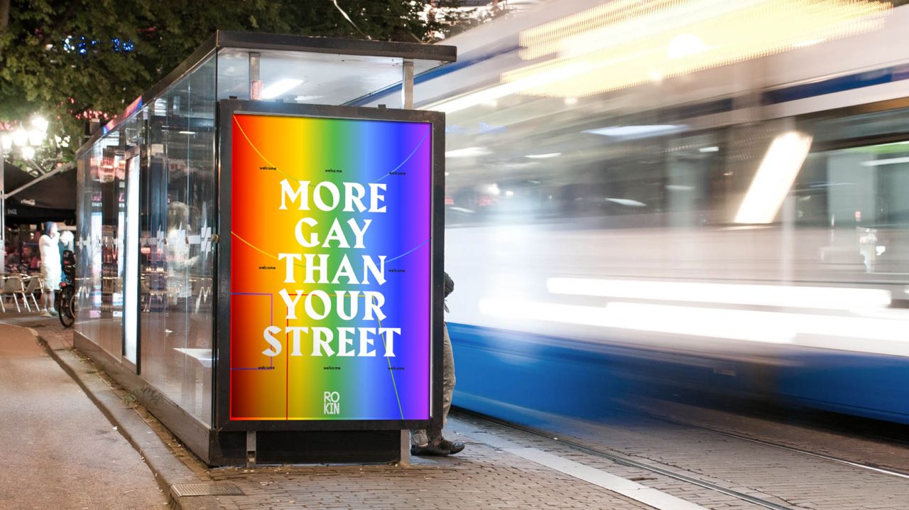
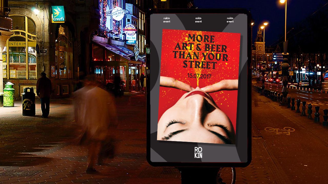
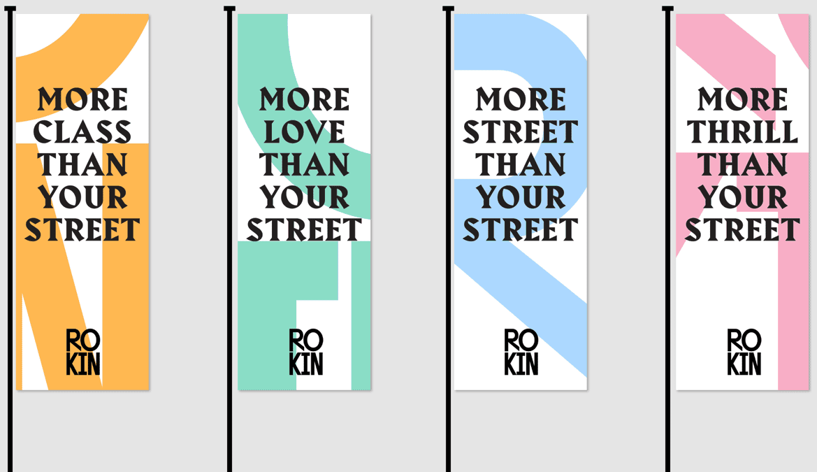
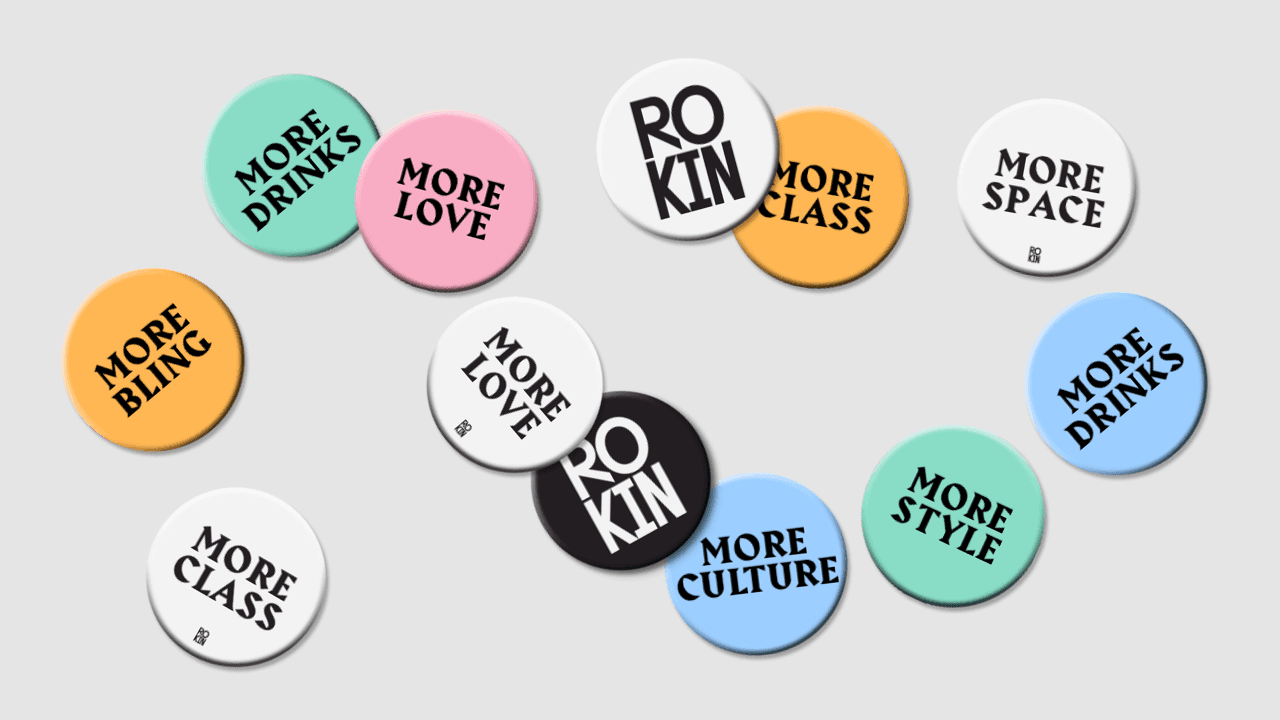
Our strategy: positioning Rokin as a central meeting point for locals, as they live further away from each other nowadays. And do it in an appealing way to Amsterdam citizens: with swagger, guts and international ambition. Therefore, our choice for the payoff: “bigger than Amsterdam”, with the campaign slogan “more street than your street”.
Together, we present Rokin as a place where there is room and ambition to experiment and where retail concepts can host their flagship stores.

Online focus on natural behavior
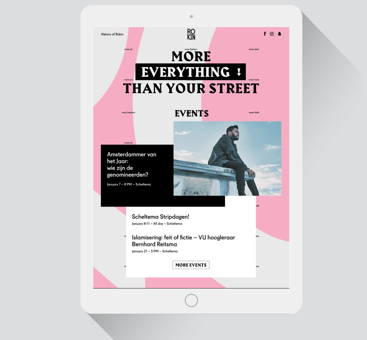
We work user-centered, but what does a website user want from a street? Certainly no map with enterprises (because: Google Maps) or a dry list of stores, because you’re not looking for a store, you’re looking for shoes.
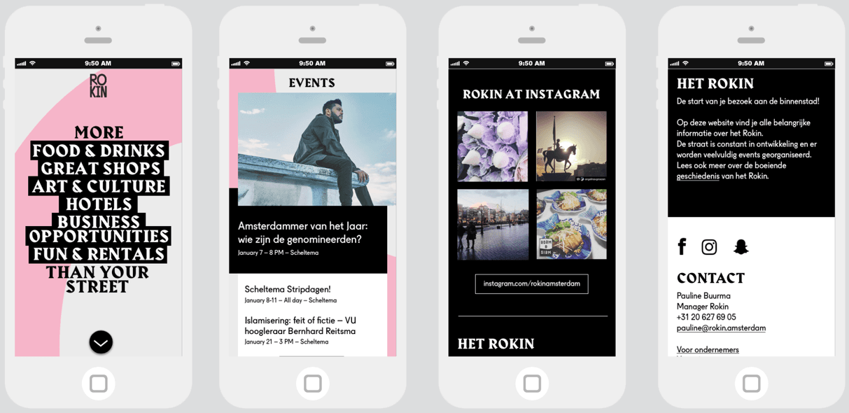
So we made a website that focuses on natural search behavior: “I want to have lunch in the city center” or “Where can I stay in the city center”. These pages are ideal for SEO and SEA and perfect landing pages for (social) campaigns.
Tech: under the hood
In the backend, we make a link with Chainels; a management and community tool that allows entrepreneurs and stakeholders to share knowledge. In order to make it easy for entrepreneurs, we sync opening hours, images and descriptions through this system. The marketing team can manage the agenda in Facebook, after which we sync this through the Facebook API.
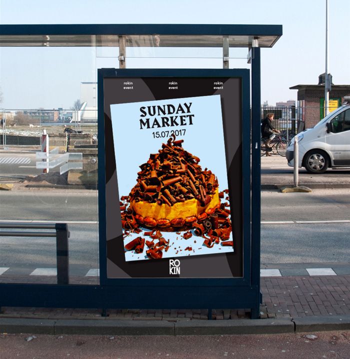
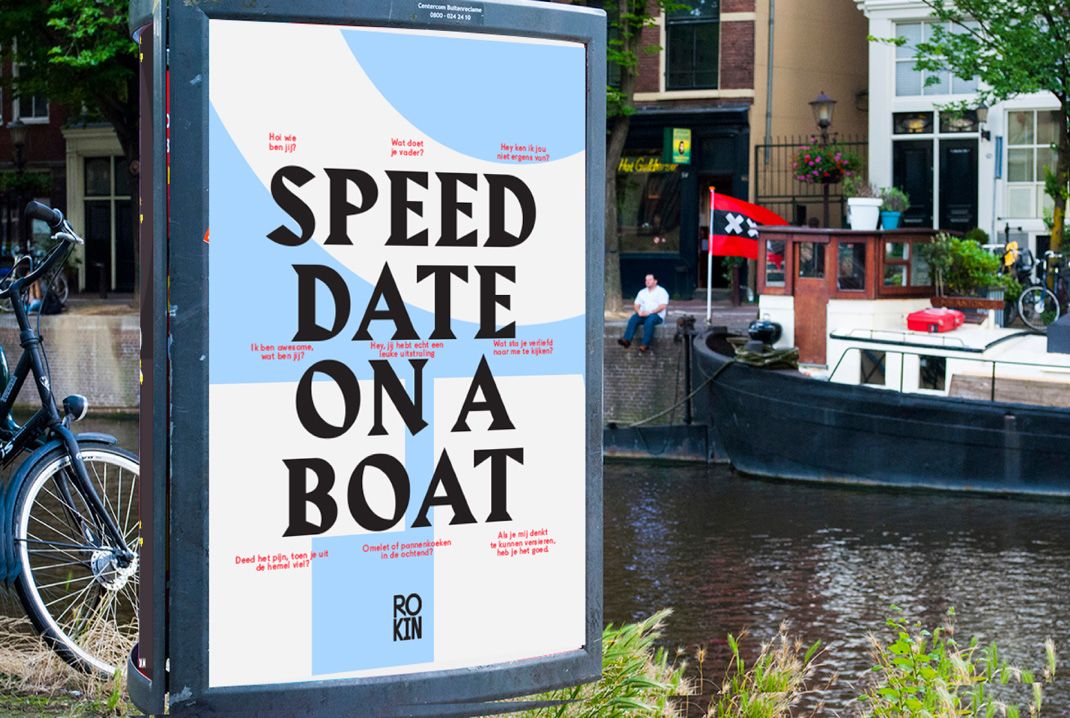
Campaign and identity are one
The visual identity has been set up with a campaign element. So, it can be based on brand awareness or the promotion of specific events or components.
Credits
For the visual style, we cooperated with Silo (Merijn van Velsen). In consultation with retail expert Soraya Oldendaal, we created the communication strategy and the payoff and campaign texts are written by Jan Wicher Emmens.
- In progress
Cordaan
Making the complexity of modern healthcare accessible
