Yoni
yoni.care/enPreparing a sustainable brand for their next big step
Startup - Scale up
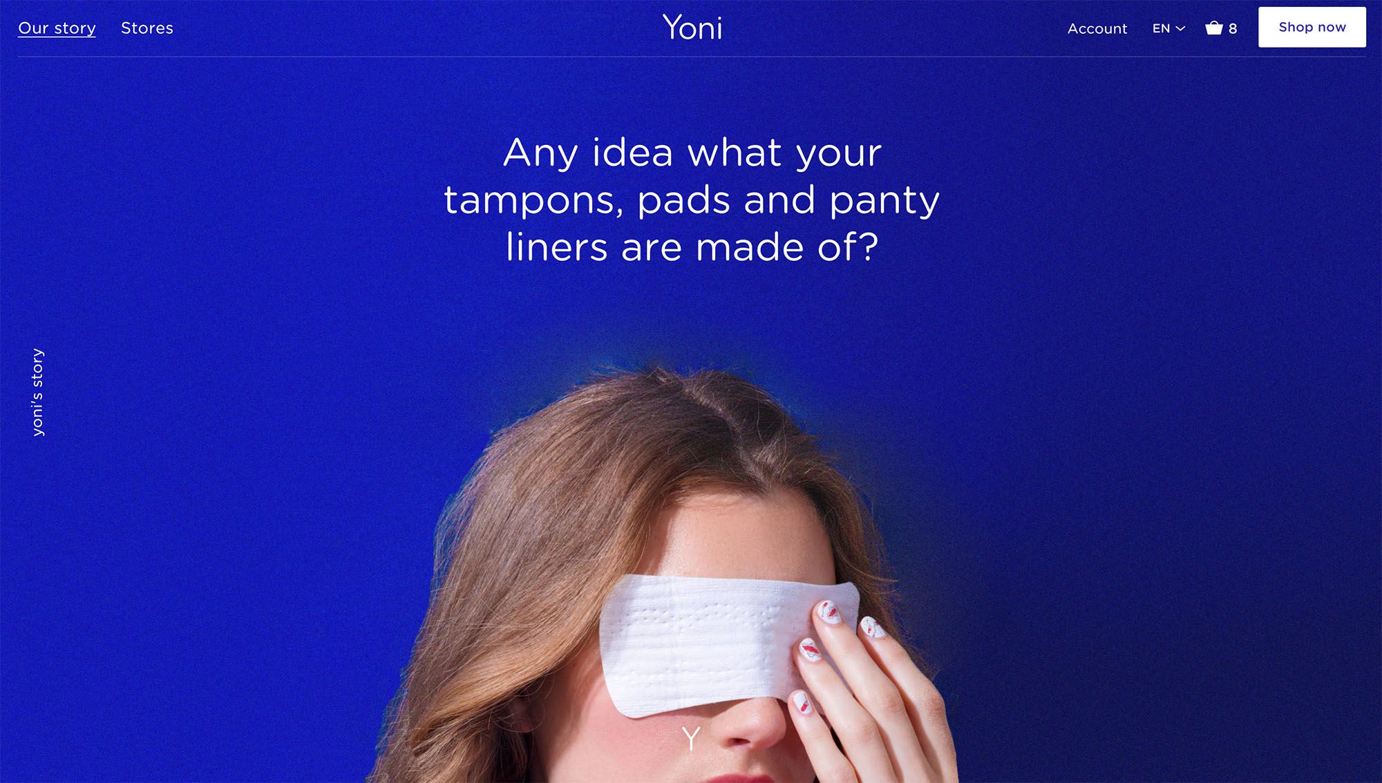
Yoni is a brand of sustainable tampons, pads and panty liners. Shortly after launch, Yoni already established a firm footing in the Netherlands, and is now expanding to other countries. GRRR accompanies Yoni with this international online expansion.
GRRR helps Yoni creating a strong digital presence, a more international appearance and high quality user interactions. And with effect, we see a strong increase in the number of unique visitors, the time they spend on the website and the number of orders.
Statistics
- 40%decrease in visitors that leave the buying proces
- 63%Increase in unique visitors at moment of launch
- 77%stijincrease in average time on pageging van de gemiddelde tijd per bezoeker op de website
Conscious alternative to mainstream A-brands
Yoni’s mission is as ambitious as it is relevant:
- Make women aware of the products they use during their menstrual period, and provide complete transparency
- Reduce the use of plastic and contribute to sustainable agriculture without pesticides by using biological cotton
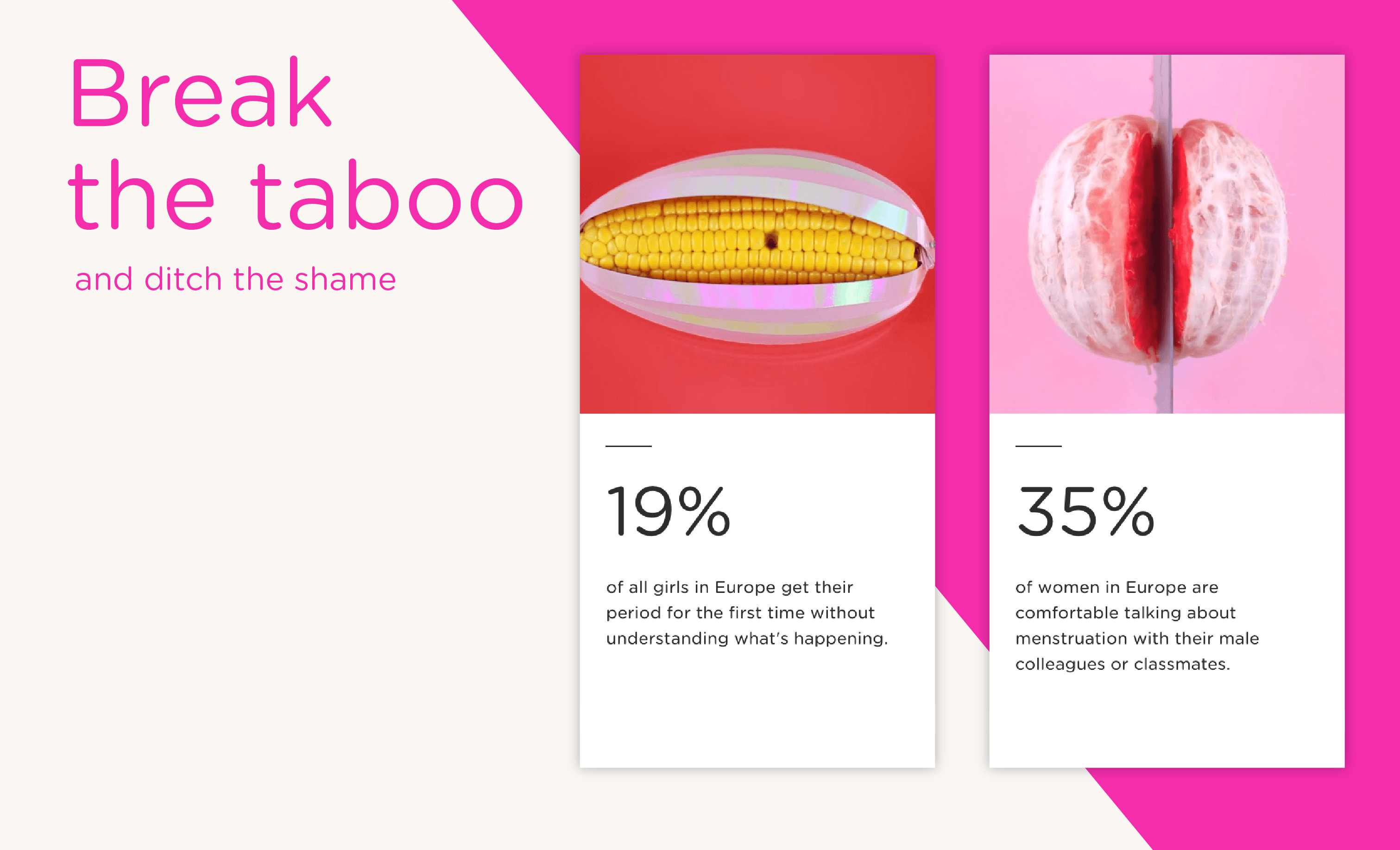
- Break the taboo around menstruation
It was back in 2011 when co-founder Mariah Mansvelt Beck first stood still by the ingredients of feminine hygiene products. She was very surprised to discover that mentioning ingredients on the packaging in Europe is not mandatory. She immediately spotted a big opportunity, no woman wants chemicals or strange substances in such an absorbent and intimate part of her body.
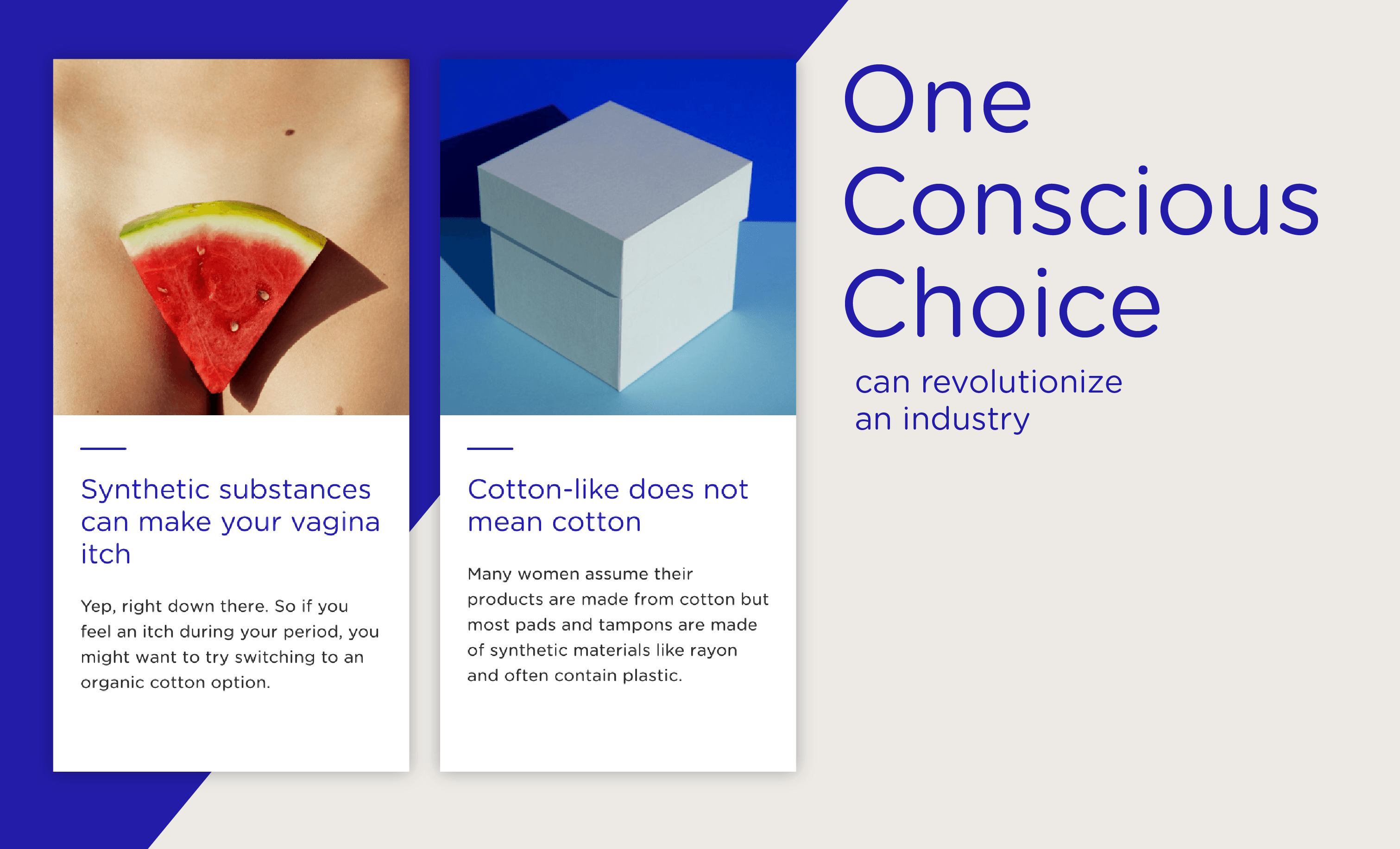
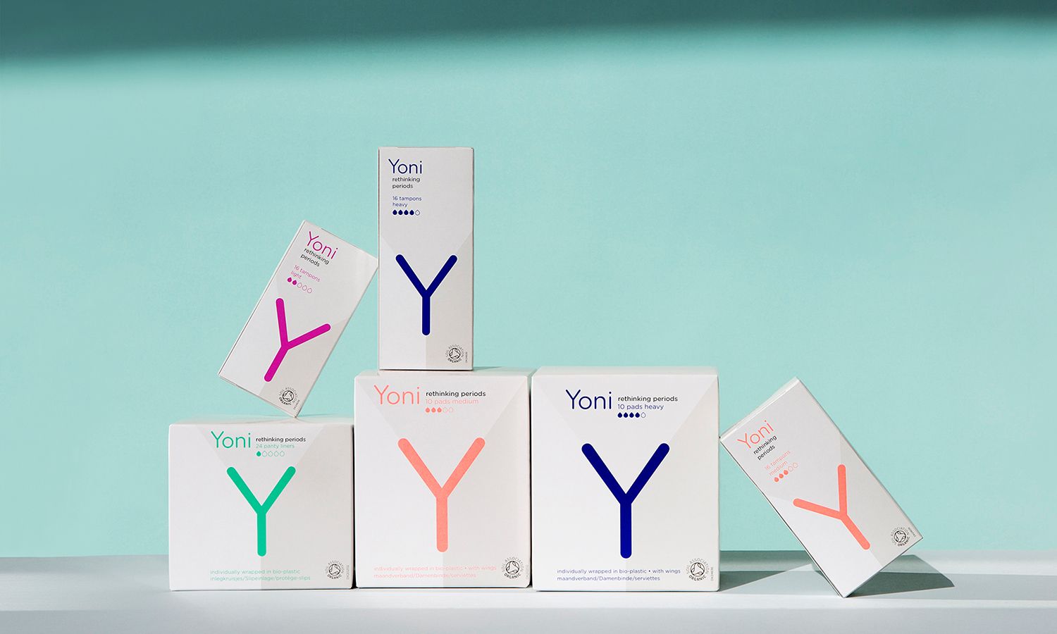
Yoni launched sales in 2015 and made a important strategic step: from a sustainable brand that is successful in a niche market to a mainstream FMCG brand that captures a place in the world of major brands. Yoni is now on shelves of Etos and Albert Heijn here in The Netherlands. This is the first time that an organic cotton brand is on the regular shelves here in The Netherlands, it even is the first in Europe. GRRR now helps Yoni with the next big step: enabling online international sales.
GRRR helps Yoni in taking an important strategic step: from a sustainable brand that is successful in a niche market to a mainstream FMCG brand that captures a place in the world of major brands. The market for sustainable and conscious growth is growing enormously. Yoni has taken the opportunity to put itself down as the conscious alternative in a market of interchangeable standard products.
Hygiene products as fashion & lifestyle
Yoni has started from an activist motivation, but the branding consciously doesn’t show that. It was very clear: the brand had to stand out without shouting and at the same time had to have a high-quality appearance within a retail area dominated by major brands. Yoni in two words: distinct and high quality.
Distinct
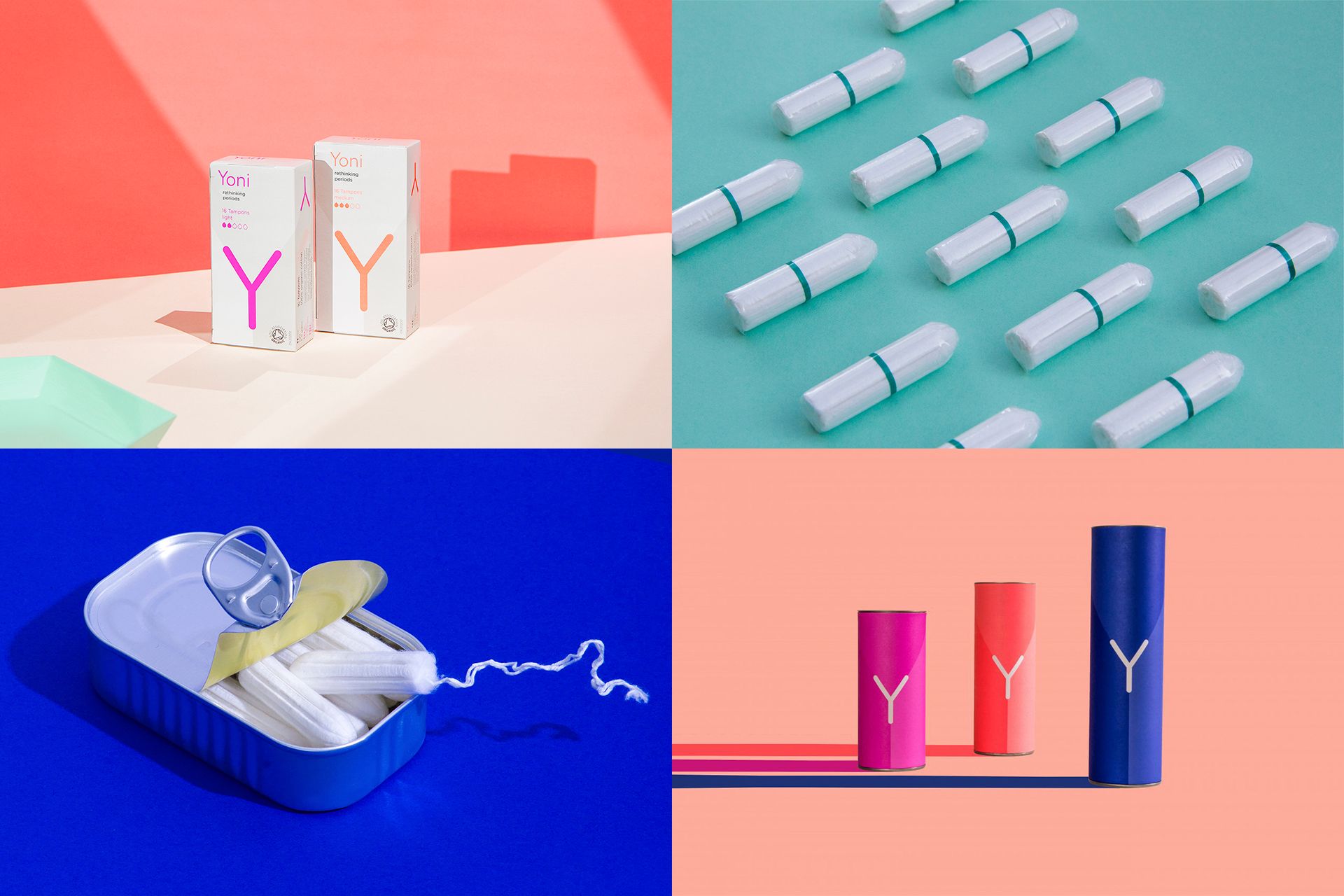
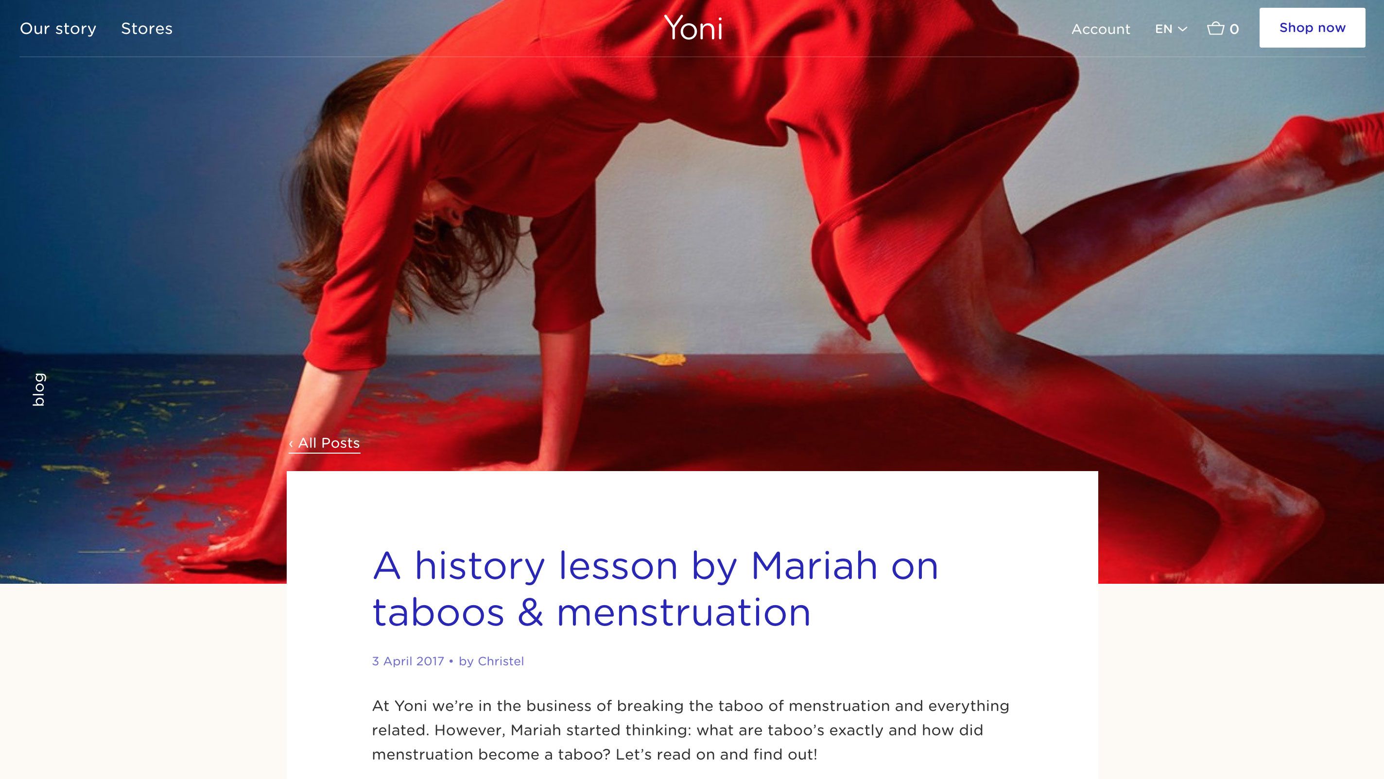
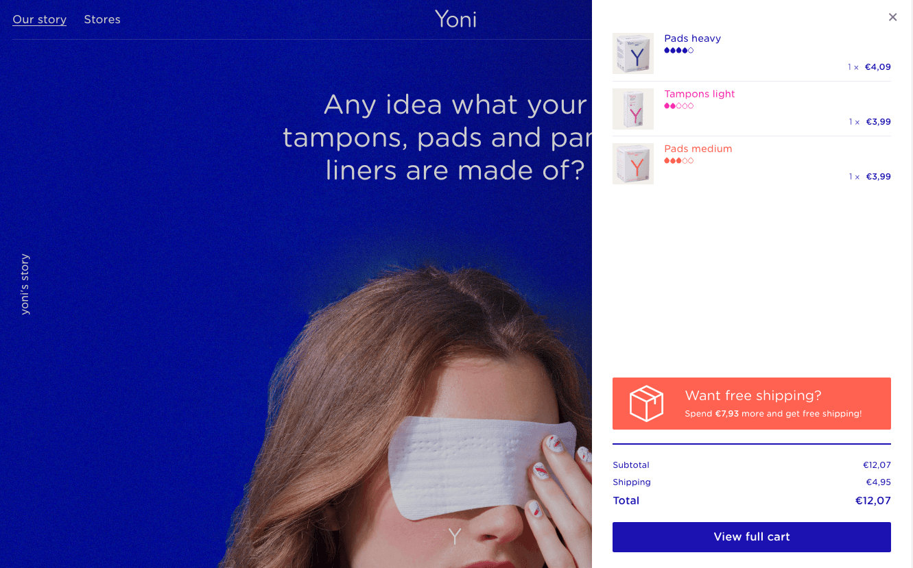
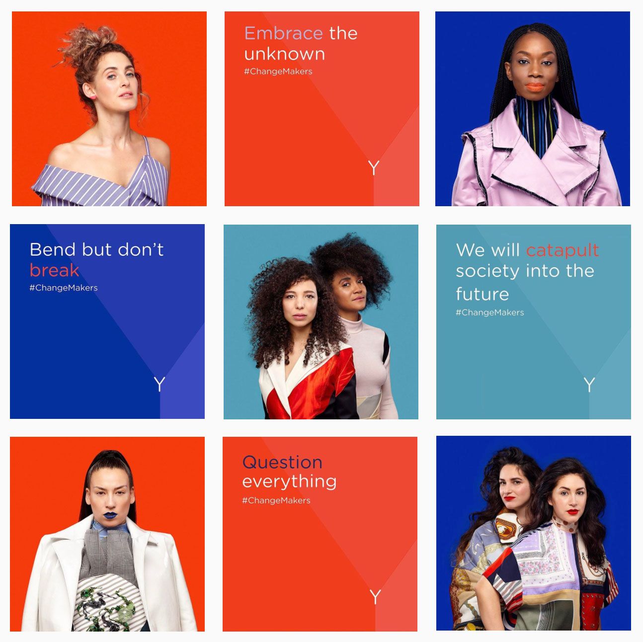
We put Yoni down as a sexy and stylish brand; Rather fashion and lifestyle than clinical and neutral. The design returns many forms that are associated with women such as Yoni’s Y (vagina in Sanskrit). With this approach, Yoni turns off the famous advertisements of lab coats and blue liquid we see in most hygiene product ad. We use the videos of designer duo Inne & Sanne to attract a wow effect with visitors. Together with the rest of the branding, these images form an exciting visual language that calls for attention.
High quality (+ Transparent)
It is important for Yoni to be seen as a standard choice. The brand has a strong asset for this: transparency. What’s on the packaging is also really in the product. Nothing more and nothing less. This transparency we see back in all aspects. Both the website and the webshop are built using storytelling principles. Thus we realize that Yoni really started out of the urge to offer products that are better for your body and for nature. The statistics behind the website tell us this approach works: many visitors first look at various informative pages and go to the webshop. Mission accomplished!

Layered Identity
Yoni already had a strong packaging on which the V and Y served as basic shapes. In addition, there was an intriguing campaign on social media. The challenge for GRRR was to use both handles to develop and implement a complete online communication strategy and resources.
Website and webshop are made as a natural translation of the Yoni brand. The letters V and Y are part of a layered identity in which the letters V and Y play a major role. Both letters are processed in different ways in branding and design. Very pronounced, but also subtle.
Scalable webshop
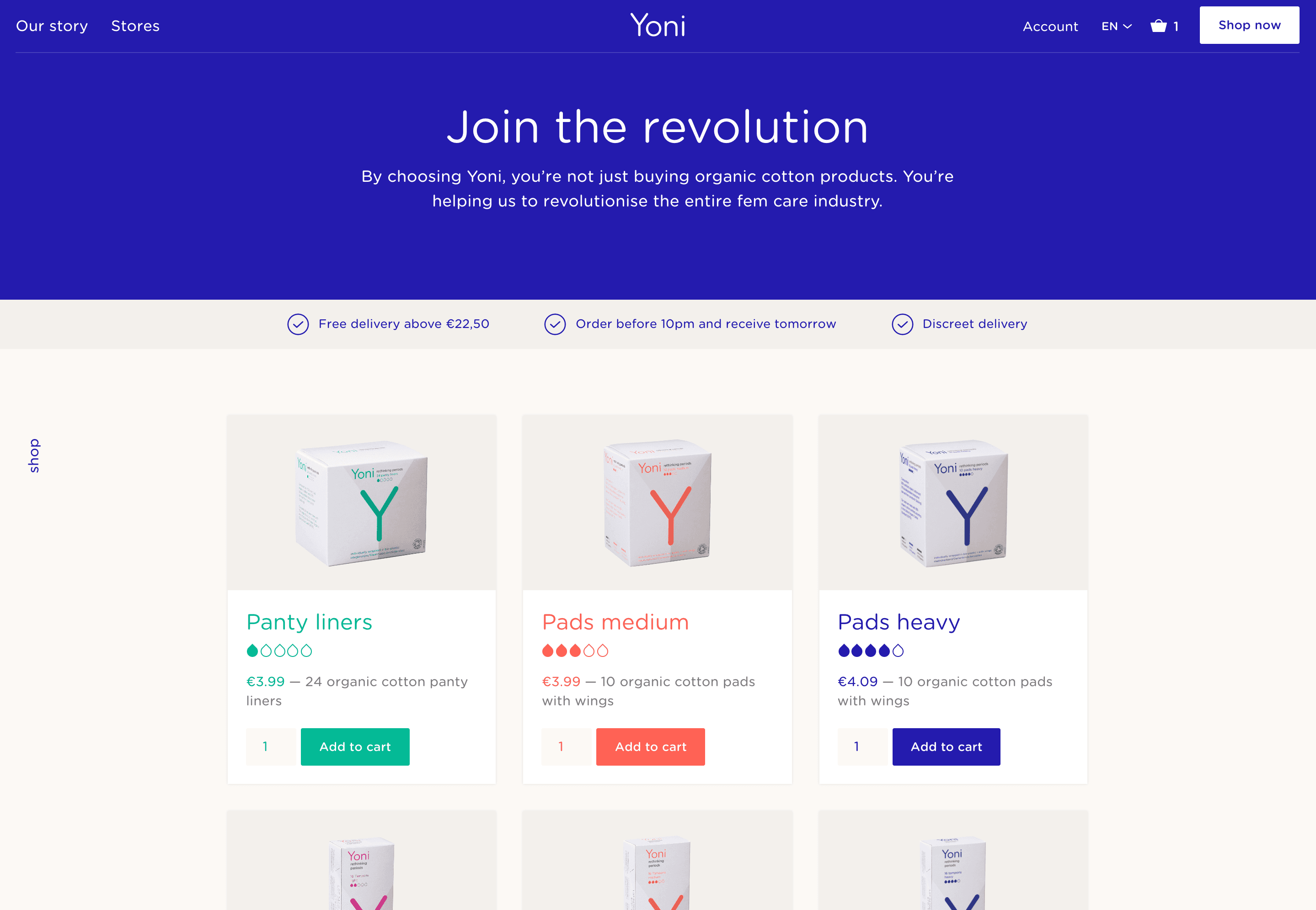
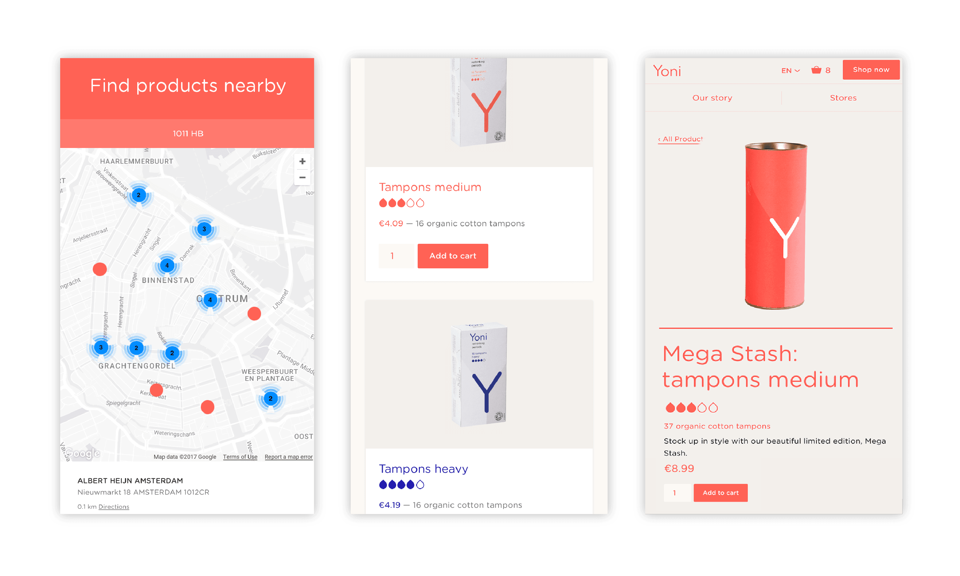
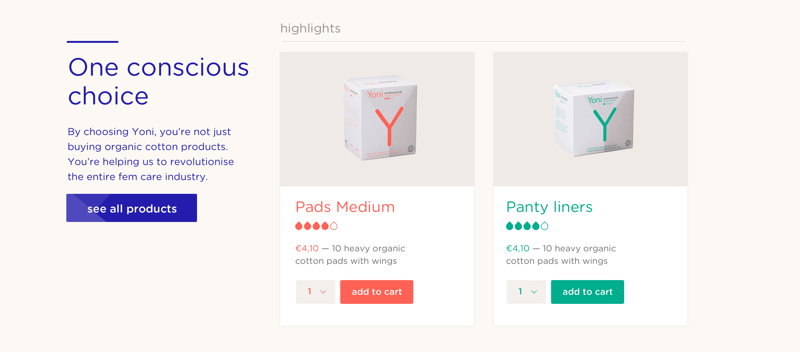
Many producers of tampons and sanitary napkins do not focus on online, and even less on online delivery. Which is surprising, given that these are products which users always have at home or on their bags and these products don’t spoil. For Yoni we thus saw a chance and have therefore placed a strong focus on the ability to order online.
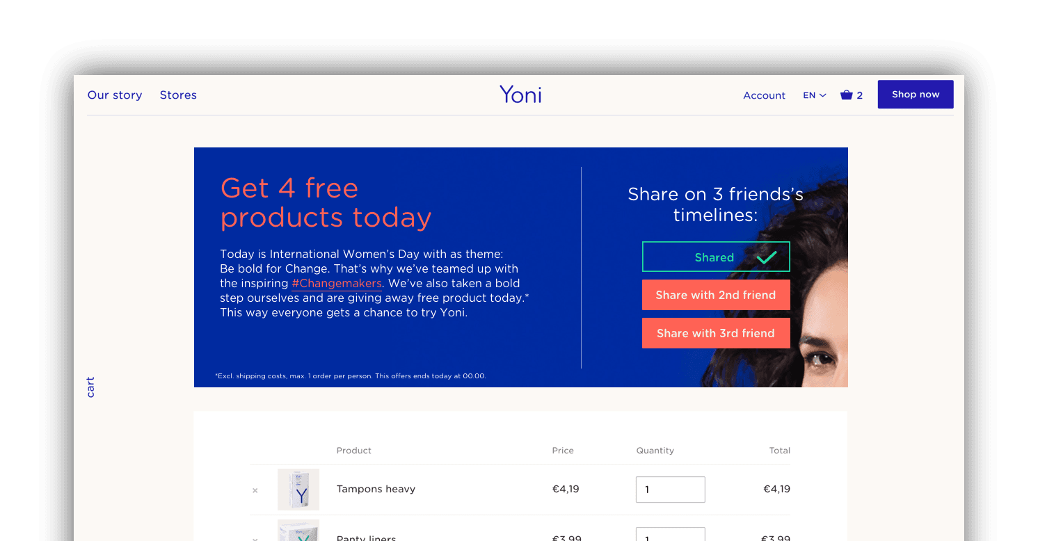
We made the website and shop with a focus on speed, ease of use and conversion. Above all, the webshop has been built on growth. We now serve customers in English, German and French. Extension to other languages is possible. We also pay particular attention to the technology at the back: adding discounts and action is simple and the order system is directly linked to the full-file system from which orders are delivered.
Credits
Yoni’s final result is a broad collaboration: Ceri Tallett (copy),Ine & Sanne (video art), Thonik (branding, packaging), W.Green (PR), Ester Grass, Anne Claire de Breij and Peggy Kuiper, amongst others (photography).
- In progress
Cordaan
Making the complexity of modern healthcare accessible
