This is why the Stedelijk website from 2017 still feels brand new
As the first museum in the world, the Stedelijk Museum made all its walls white in 1938. This marked the birth of the concept of the White Cube, which has since become the standard for museum galleries worldwide. The Stedelijk has maintained its boldness and drive for innovation throughout the years.
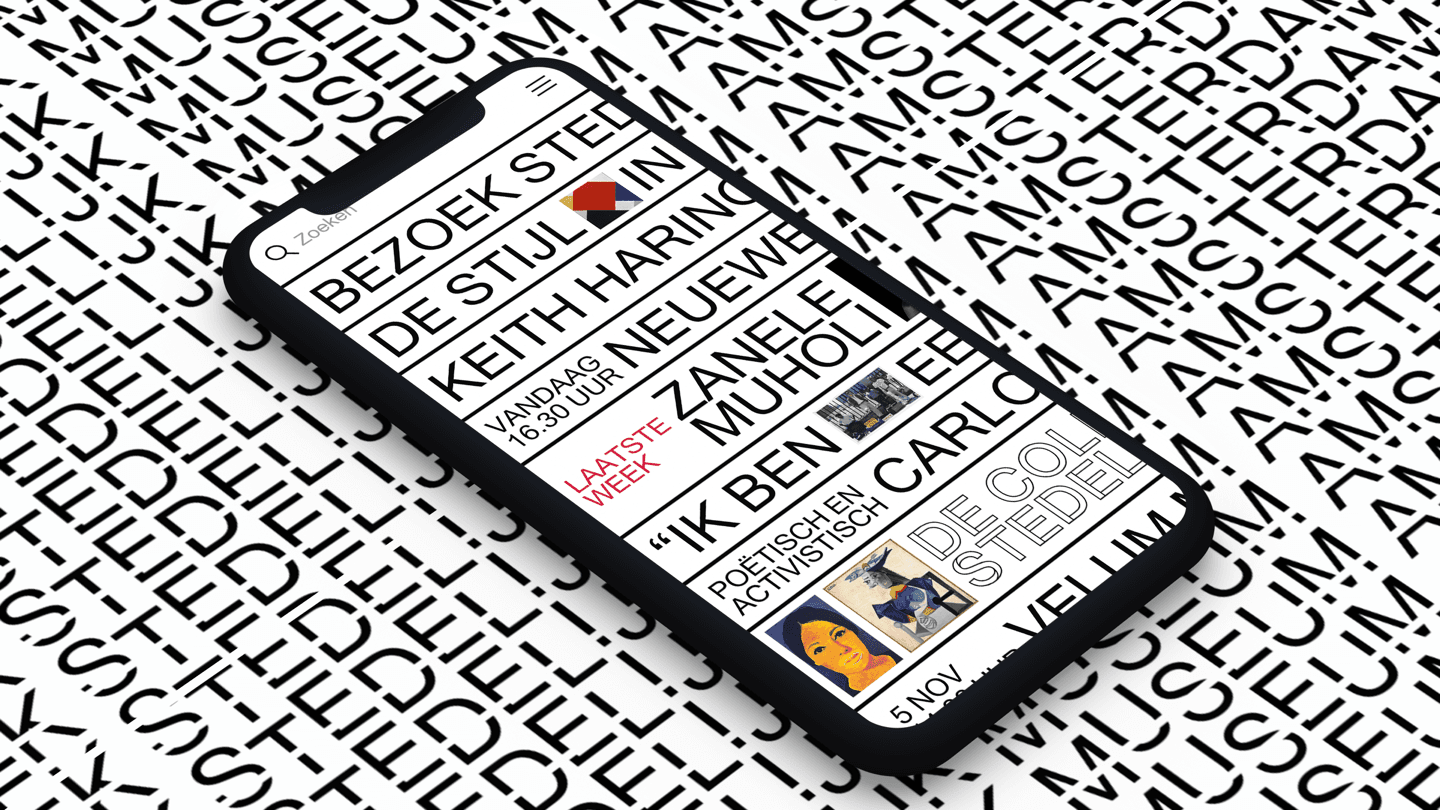
In 2017, we launched a website that embodies the distinctive and outspoken style that is characteristic of the Stedelijk. Even years later, it has not become outdated.
With the new Stedelijk website, we introduced web brutalism to a wider audience and made a visually bold statement. We also dared to make a significant shift in terms of interaction. During that time, most websites were still made as online brochures. However, we developed a highly intuitive and inclusive website. We understood the usage patterns on mobile devices and focused on swiping and the search function, making the site much more intuitive and playful to navigate. Now, getting lost in the online collection is an enjoyable experience.
Interested in learning more about how innovative design and intuitive usability come together on the Stedelijk website? We’ve written a case study on it.