Calefax
calefax.nl/Iconic style for world famous reed quintet
Style for classical innovators
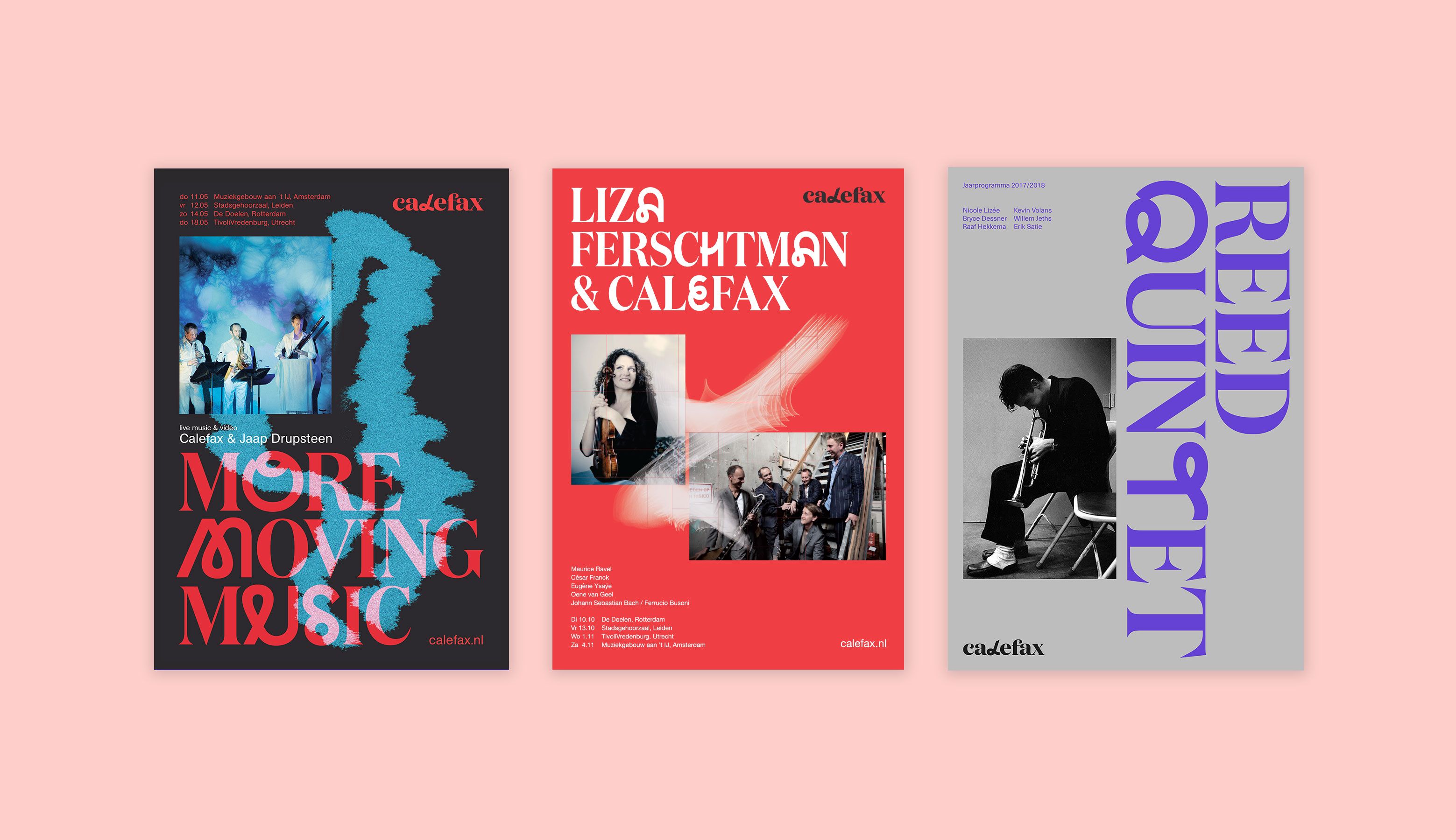
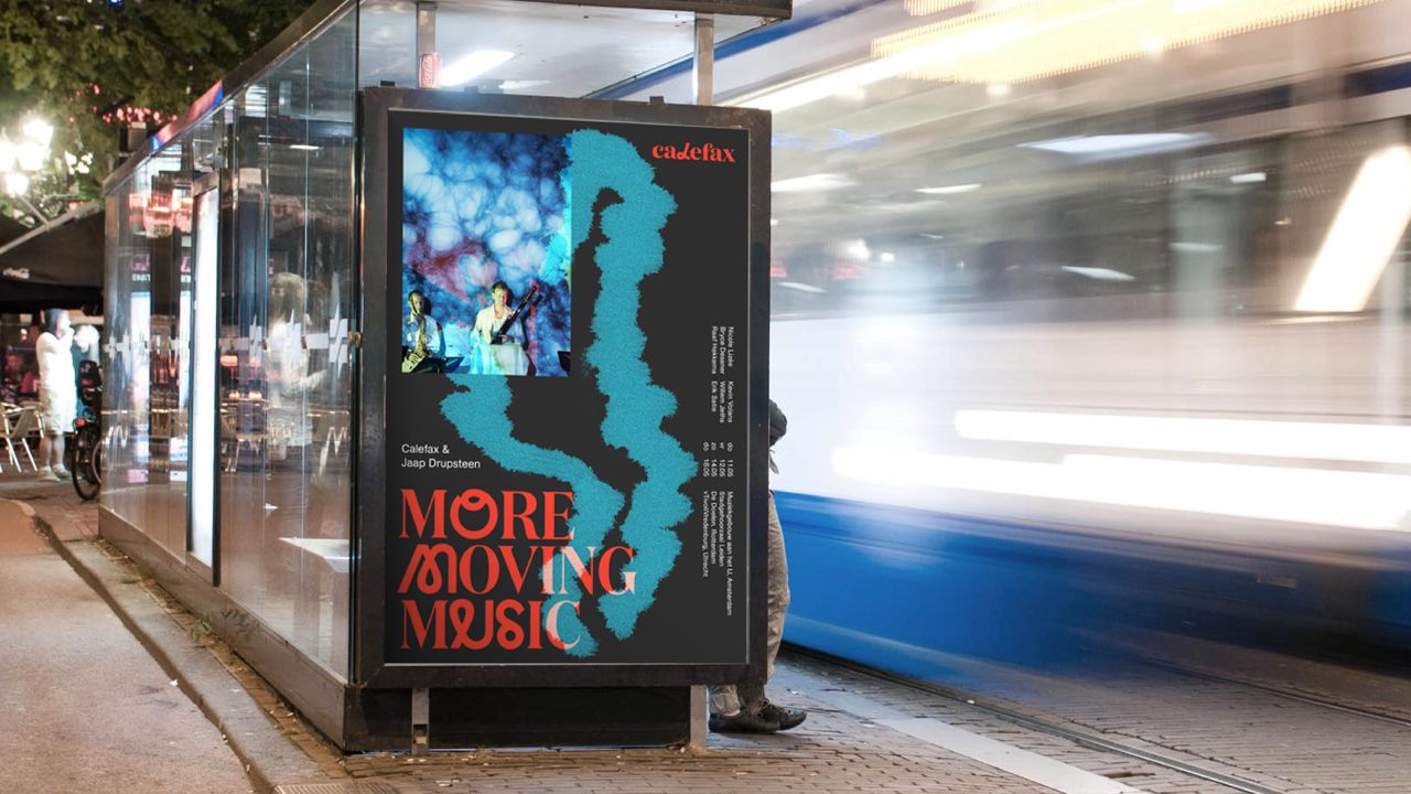
GRRR created a digital strategy and visual identity suitable to the worldwide recognition of Calefax. The new branding is accessible to a wide audience, clearly recognizable and idiosyncratic. We created a website, webshop, poster campaign and various other visual forms in cooperation with with designer Merijn van Velsen (SILO).
GRRR quickly captured the right tone. In a short amount of time, we completed the new visual style and website, including an exciting and fresh look.
Images with love for detail
The urge to innovate, their highly artistic level and the cooperations internationally appeal to GRRR enormously. Calefax calls their style “classic combined with pop mentality”. We took this creed into account when creating the original Calefax font: classic letters clashing with a modern one.
Artistic taste, knowledge of branding and technical skills are all covered at GRRR, at a much higher level then the competition. The collaboration with GRRR is pleasant and reminds you of a real partnership. It's open, full of energy, a perfect balance between creativity and professional effectivity, critical, and every time inspiring.
Unbelievable ... Almost everything that Calefax takes care of, turns into gold.
Calefax
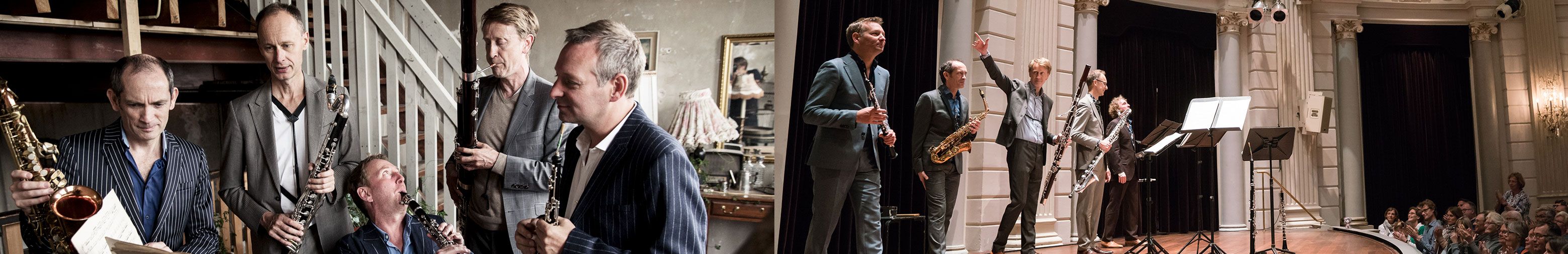
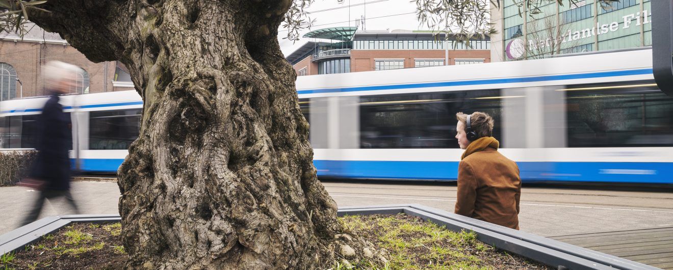
Calefax is a formation of five highly qualified reed players: they are seen as the inventors of the new genre reed quintet. Besides that, they have a worldwide reputation regarding magnificent play, brilliant arrangements and a fresh stage presentation. As a classical ensemble with a pop mentality, they form an inspiration for young players all over the world.
We applied this to the logo. It consists of classic letters with an intervention in one of them. The ‘l’ has been replaced by a modern letter, with the same grace as the classic letters. This change symbolizes the Calefax method. Existing classical works are bend to their own style. This creates a contemporary and unique character.
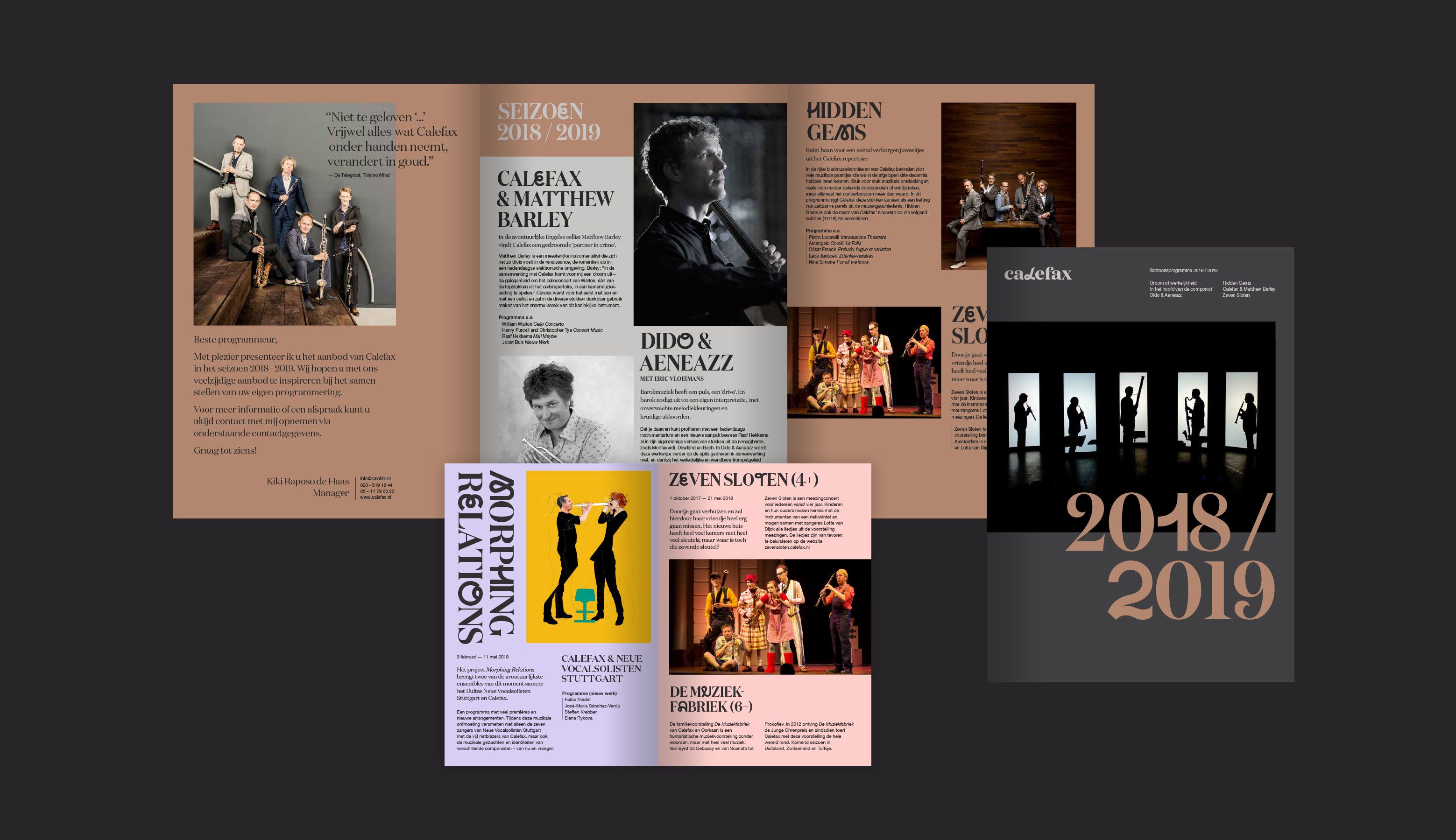
The website consists of a clear system in which it is pleasant to navigate. A user test told us what information visitors are mostly looking for. Based on that, we classified the information on the website. We have chosen for a six color palette. Three primary colors derived from the instruments and three secondary colors. These secondary colors are bright and provide the style with a modern twist.
Stay tuned...
GRRR stays connected with Calefax as their branding and digital partner. What’s more coming? Perhaps innovative promotion campaigns where we make use of Virtual or Augmented reality.

- In progress
Cordaan
Making the complexity of modern healthcare accessible