Hogeschool van Amsterdam: CMD
cmd-amsterdam.nlExplosive branding that attracts new design talent for years
Icons as building blocks of a visual language
How do you create a design that remains strong in attracting the target audience for years? The Communication and Multimedia Design (CMD) program at the Amsterdam University of Applied Sciences aims to appeal to creative design students every year. However, they must do so within the HvA (Hogeschool van Amsterdam) visual identity. Unfortunately, this isn’t exactly the type of style that appeals to creative individuals. So, some liveliness was needed in the style.
We developed a flexible visual language that gives the program its own identity and can also be used by the aspiring designers themselves. It’s a design style that still works like a charm: the principles of the style we developed in 2014 are still a big hit. However, the style has beautifully evolved with the times and received updates in 2017 and again in 2020. There’s no need to throw everything away and start from scratch each time; we design for the long term. It’s sustainable and long-lasting.

Designing for designers
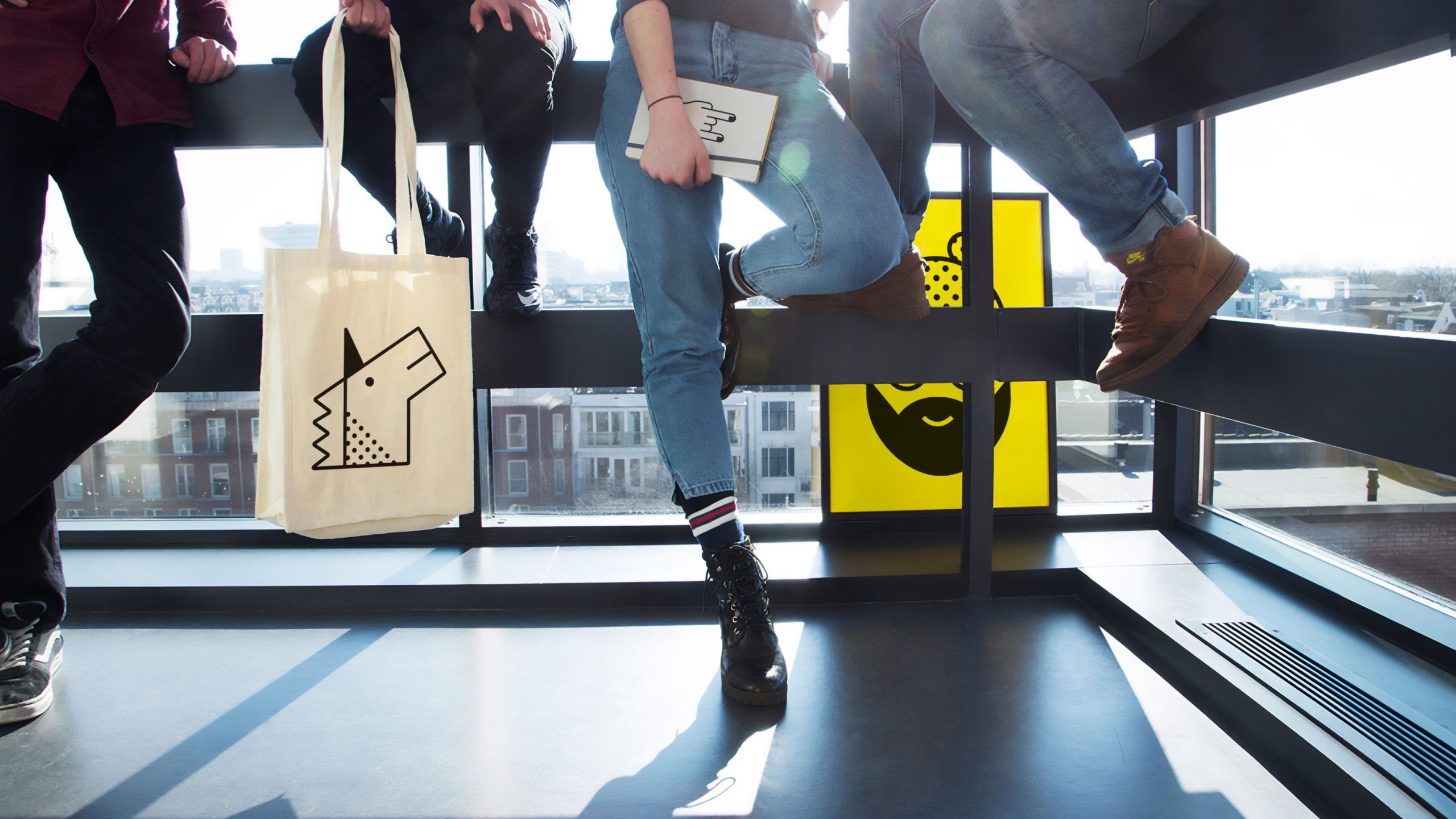
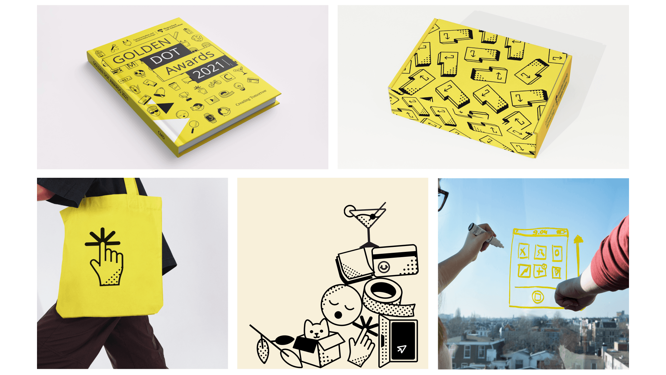
CMD leidt studenten op tot interaction designer, visual interface designer of front end developer. We hebben die CMD-cultuur verbeeld in een serie iconen rond creativiteit, digitale tools, geeks, studentenleven, techniek en web.
De ontworpen iconen zijn los in te zetten, maar ook op te stapelen tot totems. We hebben de iconen ook gecombineerd in fotografie en zo kleine verhalen gemaakt die verschillende facetten van CMD laten zien.
Statistics
- 163kunique visitors
- 12advertorials
- 952kimpressions
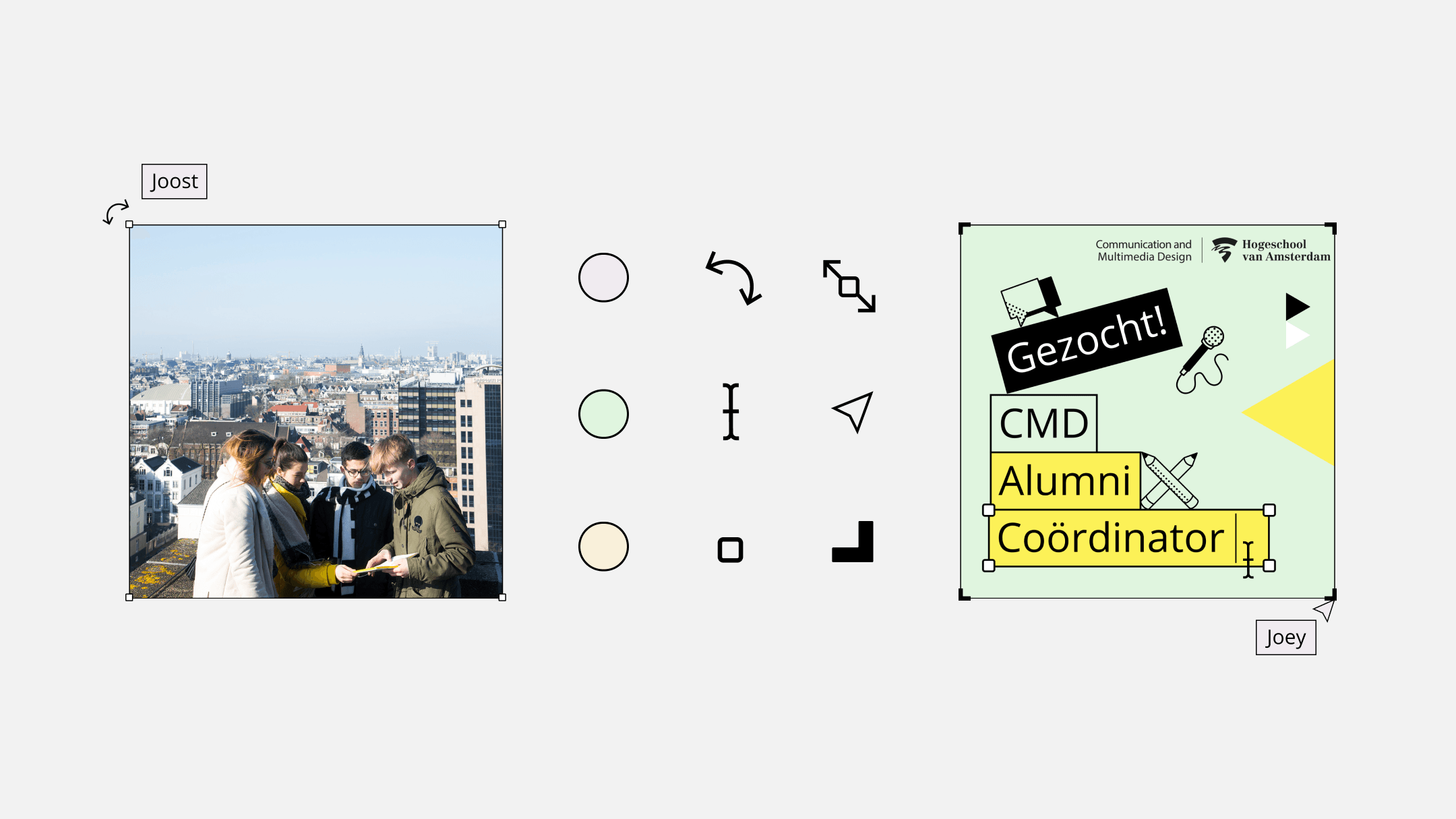
A DIY design toolkit
How exciting is it to involve the creativity of the aspiring designers in developing and establishing the style? This calls for a design system that maintains the style even when used in various ways. We developed a design system that is creative, flexible, and easy for everyone to use. Think of it more as a toolkit than a brand book with a set of strict rules. We deliberately opted for a visual language instead of a logo, so that the style can be easily used within the existing HvA visual identity.

- In progress
Cordaan
Making the complexity of modern healthcare accessible