Doctors Without Borders
Rebranding with a focus on storytelling and conversion
We see a new generation of donors who choose urgency over loyalty. How do you remain relevant and appealing in this world as an NGO? We help Médecins Sans Frontières to act as “human brand,” and to communicate with its audience as a human being.
With the Nobel Peace Prize, almost half a million donors and more than 7000 employees, MSF is one of the world’s leading aid organizations. We are committed to designing a new corporate identity. It began with the refurbishment of the donor magazine, which led to a broader rebranding.
Building on this DwB developed a new website and campaigns which lead to an increase in donations of 163% and 160% increase in conversions.
Statistics
- 163%increase in donations
- 160%increase in conversions

Footage as a booster and for recognition
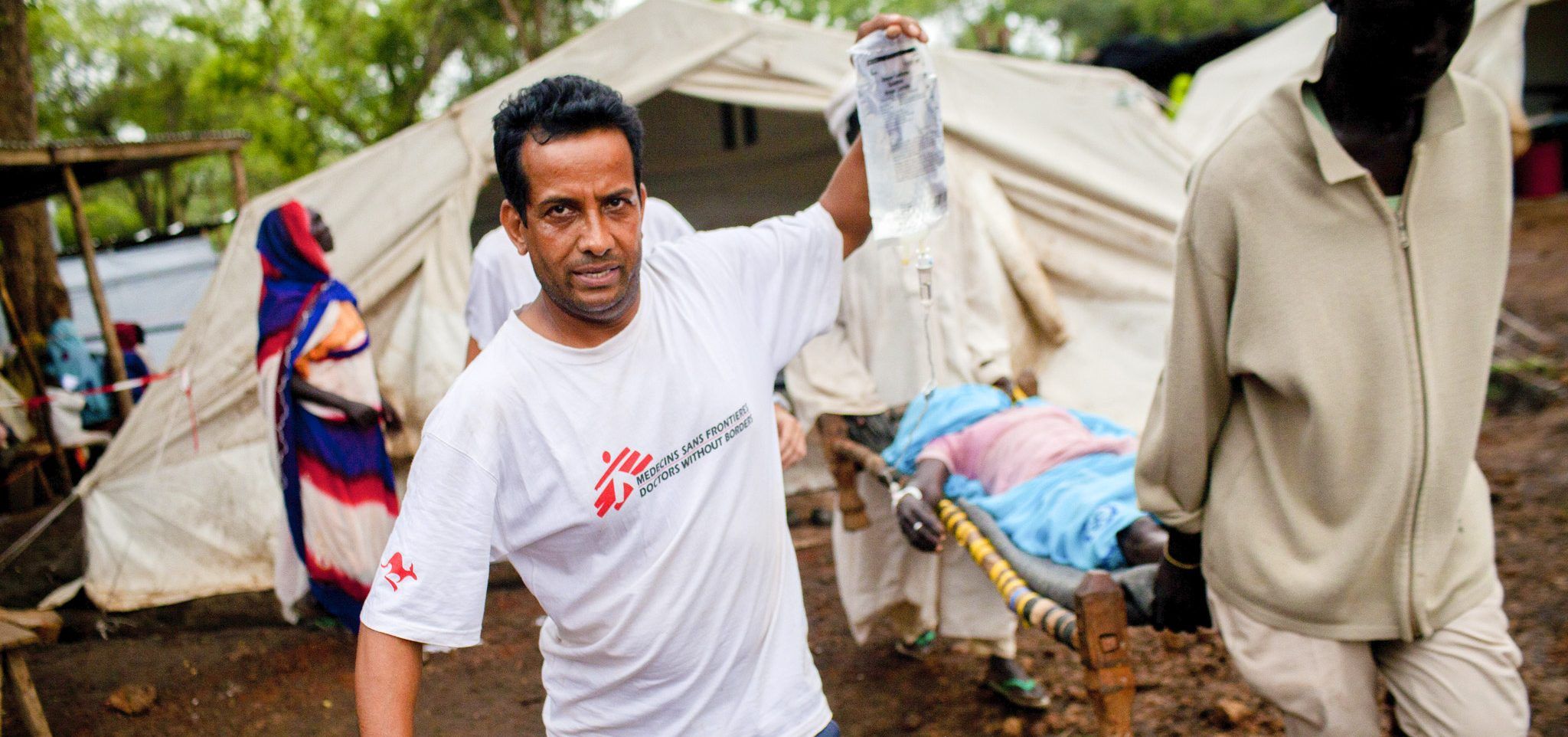
Médecins Sans Frontières is about their people and the actions of their people. We therefore choose images that engage the viewer. The viewer does not stay at a distance, but becomes part of the situation shown by the image. For the design, it means that the content is more important than the logo. Therefore, we try to capture the logo ín the actual photo as much as possible, rather than sticking the logo on it.
Graphic details
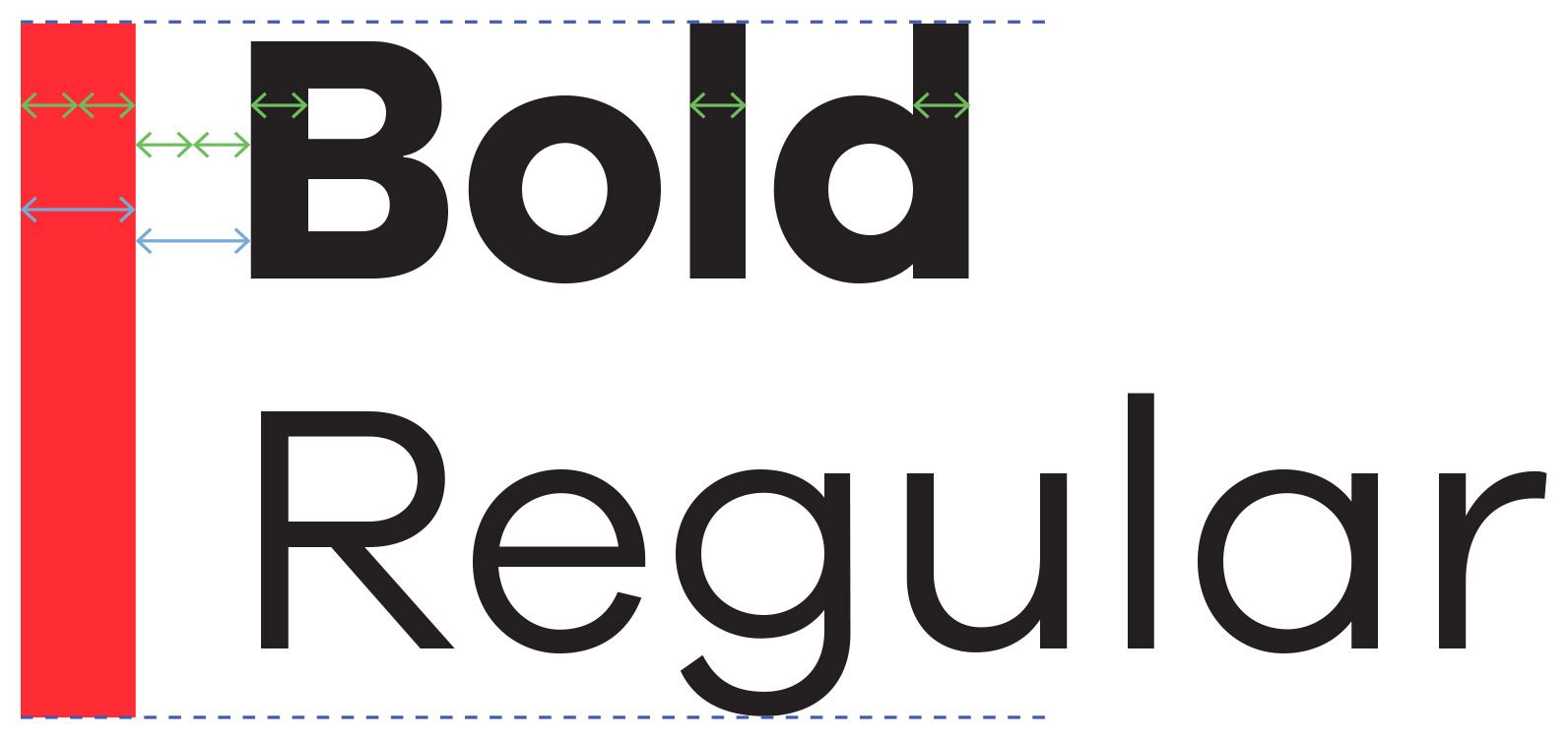
To draw attention we use a broad red bar. We also use short and powerful sentences for an active appearance. We searched for a font that has a lot of impact in lowercase letters to be able to stay subtle while also expressing urgency.
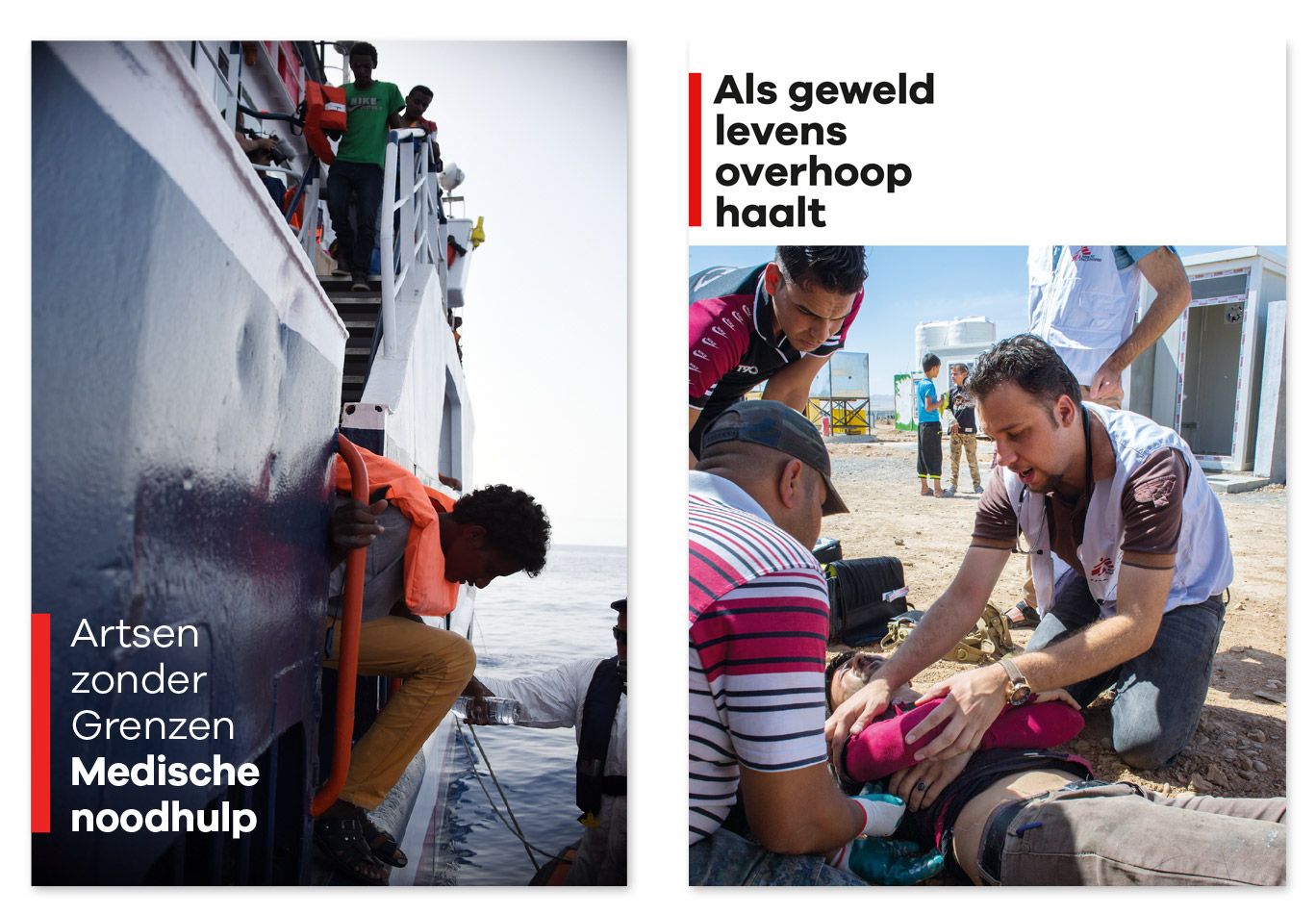
Human brand
Research proves: we judge companies as if they were people. If you are asked by someone to donate money for a charity, two questions arise: Is this person trustworthy, and it true what he says?
These are questions that MSF should also be able to answer as a company. Being a ‘human brand’ helps with that. It means trying -as an organisation- to communicate as a human being as much as possible. The right use of text, photography and video are important means. This also applies to the use of the logo, color use, typography and layout applications.
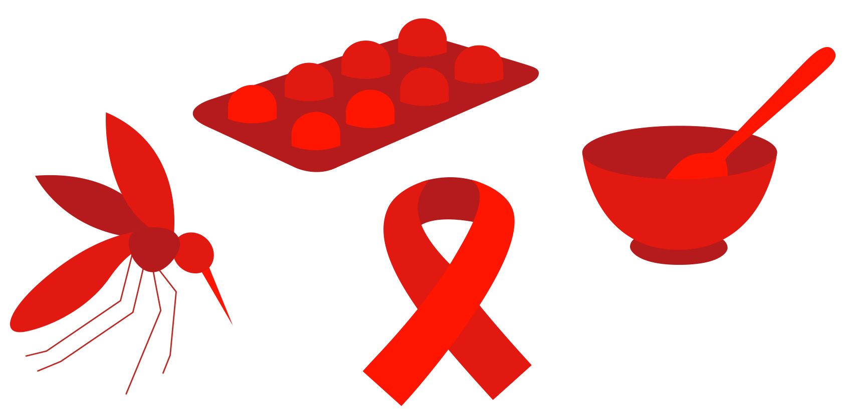

Storytelling with numbers and icons
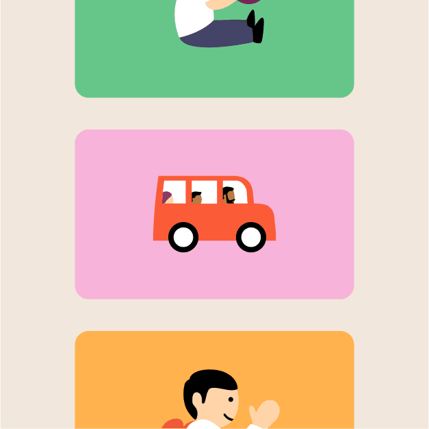
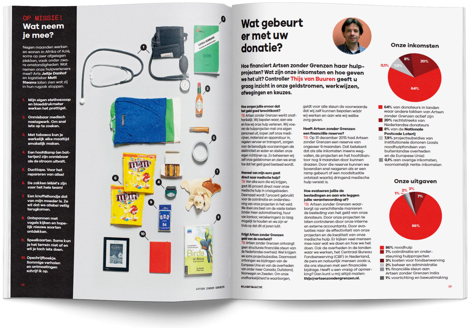
Illustrations, icons and infographics are also a good way to tell the story. They help to support the content and can be scanned quickly. The shapes used in the illustrations, icons and infographics are strong like the rest of the identity. In addition, multiple shades of red are used for nuance.
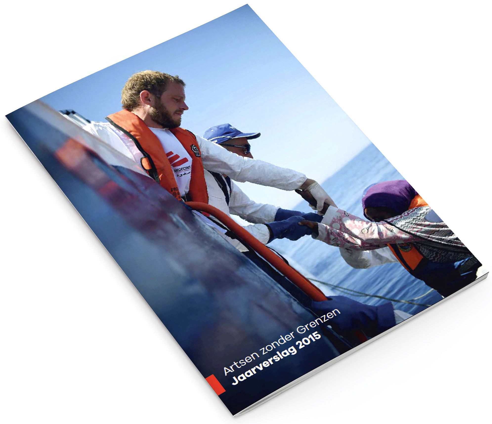
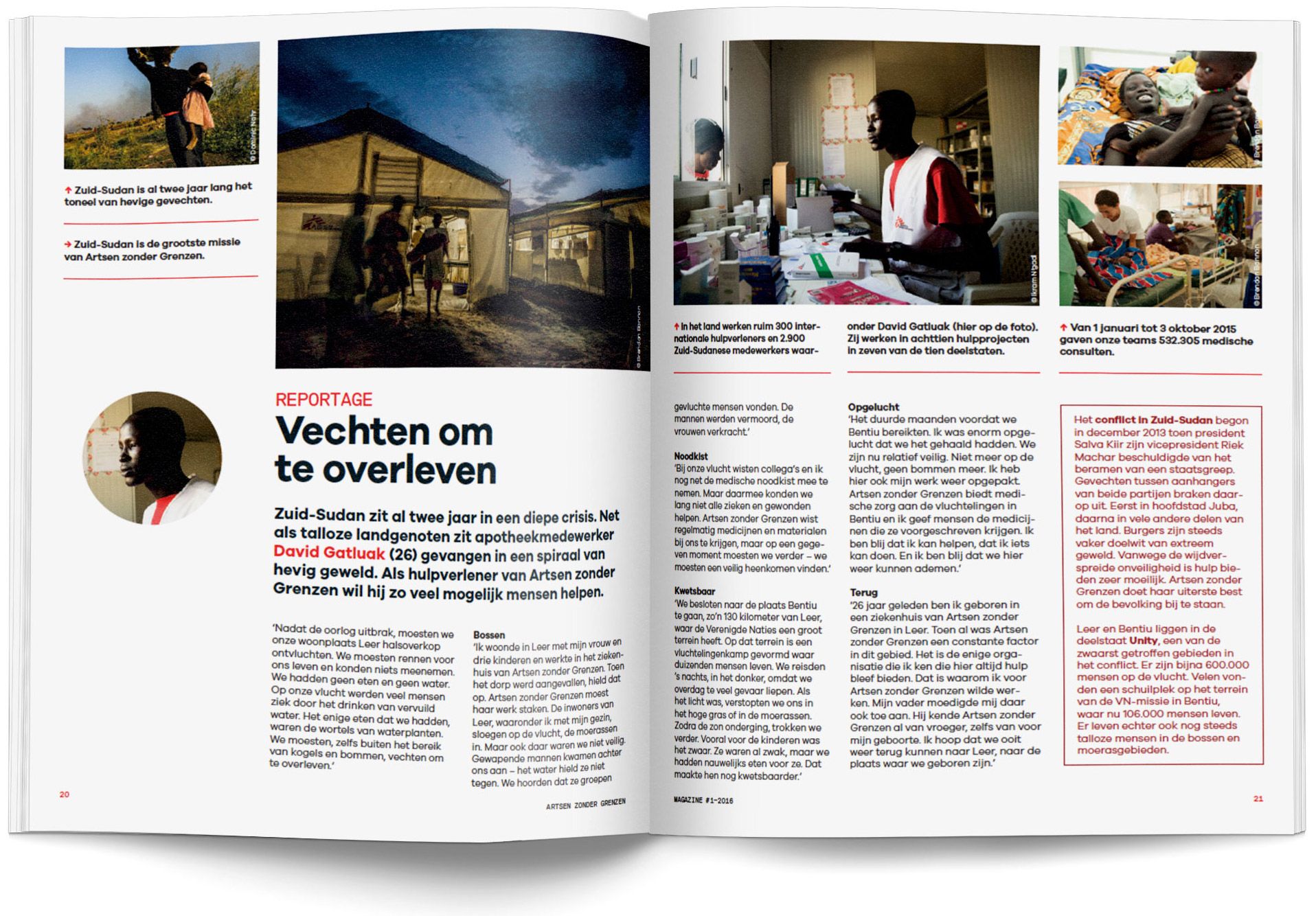
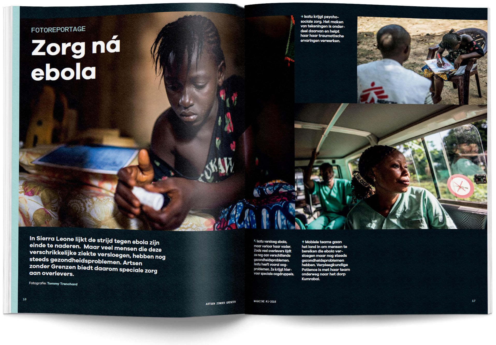
A new magazine
The biggest fear when restyling a magazine is the possibility of unsubscribers. Often this is also the case. However, the new MSF magazine was received more positively than the previous design.

Credits
MSF has always worked with excellent photographers. Without them the commitment of the organization would never appeal to its donors so much as it does now. On this page we used images (amongst others) of: Mario Travaini, Christophe da Silva, Phil Moore, Nicole Sobecki, Olga Victory, Ikram N’gadi and Amandine Colin.
- In progress
Cordaan
Making the complexity of modern healthcare accessible

