Drops
languagedrops.com/A language app that flies beyond language borders
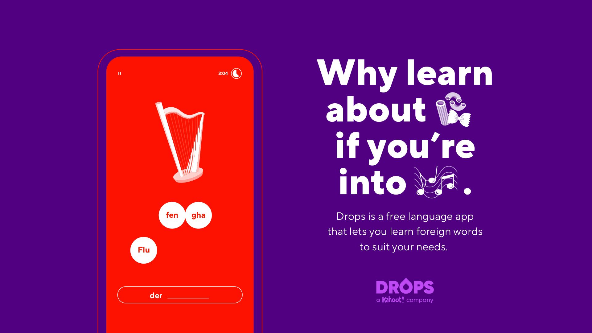
Learning a new language is extremely popular. And at language app Drops they know exactly how to make this really fun. Drops is the fastest growing language app in the world and offers a unique learning method. A small hint? To portray. Sounds simple huh? But it works everywhere, because brains work the same worldwide. Everyone prefers to learn when it’s fun, and remember things better when you see them.
This strategy ensures that people worldwide can already learn 42 languages via Drops. And that the app has already been downloaded 35 million times worldwide (and counting!). Kahoot!, one of the largest education platforms saw the gold of this formula and chose to incorporate Drops. After we had been working with Drops for a year, that suddenly resulted in an investment of 50 million. That says something about the potential that this scale-up has to be used by many more people worldwide.
A scale-up with international growth potential
Even with 35 million downloads, the growth potential is still enormous. Just think about it: the world is getting smaller and smaller. And the need to understand other languages is universal. And that does not go unnoticed. Google named Drops the best app of the year, and in 2019 Fast Company ranked this language app in the top 10 most innovative organizations in the world in the field of education.
Drops set the ambition to double the number of users. With such goals for growth and the acquisition by a major player, you need a strong brand and a clear brand structure. GRRR worked with Drops on the brand strategy, branding and designing the 25,000 (!) icons.
Statistics
- 200countries
- 35mdownloads
- 2.5kiconen
Building a strong brand that activates immediately
We started by vetting the numbers. Where can we as an agency make the difference to achieve that 200% growth? But also, how to build a strong brand for the long term?
We saw that Drops works very lean. New ideas are always rolled out in phases and extensively tested. This is how Drops is able to respond quickly to trends and user needs.
Their short-term activations were therefore good. But due to the strong growth ambitions, many sub-brands and the parent brand Kahoot! that had been added, the brand could use a clear brand structure.
With workshops, sketches, best practices and the better conversation, we helped to cut these strategic knots. Together with Drops, we determined the brand values that are both typical Drops and with which Drops can really distinguish itself. In the case of Drops, these are fun, inclusive and simple. We made sure that those assets are tangible in the brand design. The visual design is dynamic, has cheerful colors and there is a lot of animation. Using the app is also simple and fun: learning a language feels like a game and with every step you take you get a sense of accomplishment.
Inclusive images
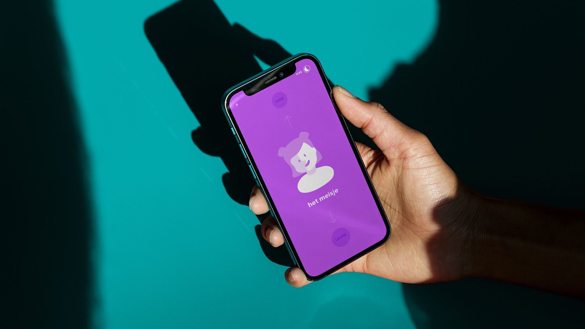
The success of Drops is due to the power of portrayal. In the app you learn a language based on images. Part of the branding was to illustrate all these icons in the app. We’ve done 2500 now. In a clear and distinct style, of course. Here too, we are committed to inclusiveness. For example, we quickly changed a woman with a sexy short skirt who had to represent a ‘waiter’ into the gender neutral Sam with a tray. Soon we also had to deal with more difficult icons: how do you portray breakfast, if in Vietnam it means a steaming bowl of rice and in England it means a plate of beans and bacon? This requires a brand that is truly understood and inclusive everywhere.
- In progress
Cordaan
Making the complexity of modern healthcare accessible
