Mooi NL
A flexible design system for the major challenges of the Netherlands
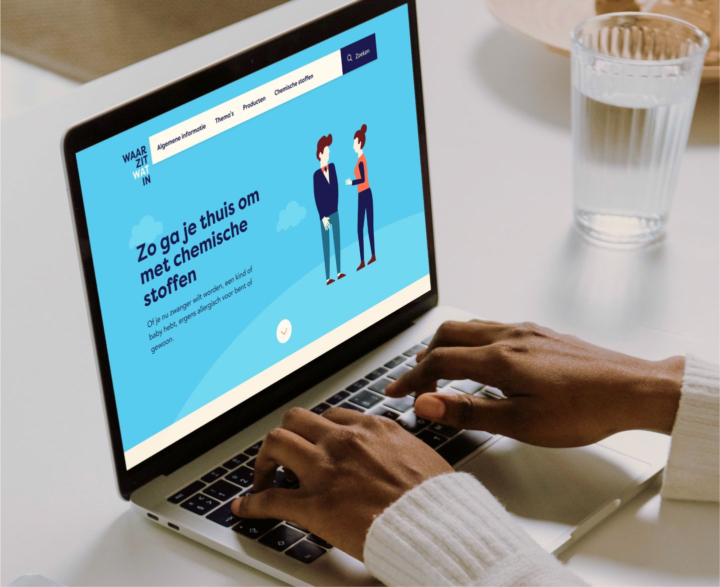
It is quite a complex puzzle: how are we going to organize the scarce space in the Netherlands? How do we ensure that it becomes easier to find a home and at the same time do not exacerbate the nitrogen emissions? Mooi NL is the program of the Ministry of Housing and Spatial Planning that tackles these problems. This program offers future proof solutions for the scarce space in our country: beautiful, functional and sustainable.
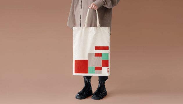
We created a branding for Mooi NL that involves governments and institutional partners. But at a later stage it also communicates clearly with society as a whole. And as you can see around you, everyone nowadays has a strong opinion about a top-down government. We therefore designed a style that exudes authority, but is also open. A style that can be used sustainably in different phases of the project and in different contexts. And that within the existing government visual style and fool proof in use by the many government officials involved. These are many complex factors that require a smart simple design solution.
A design for change
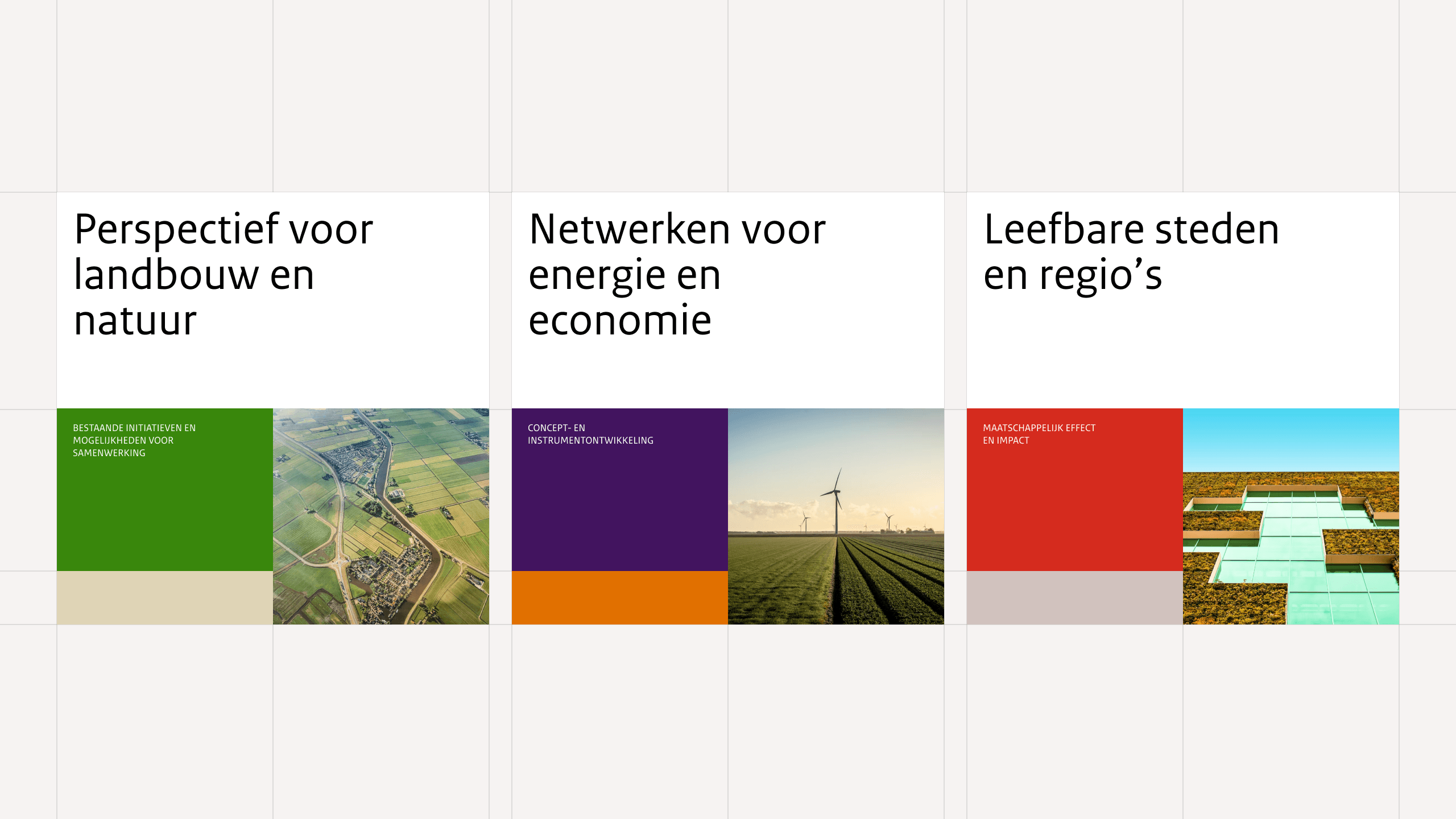
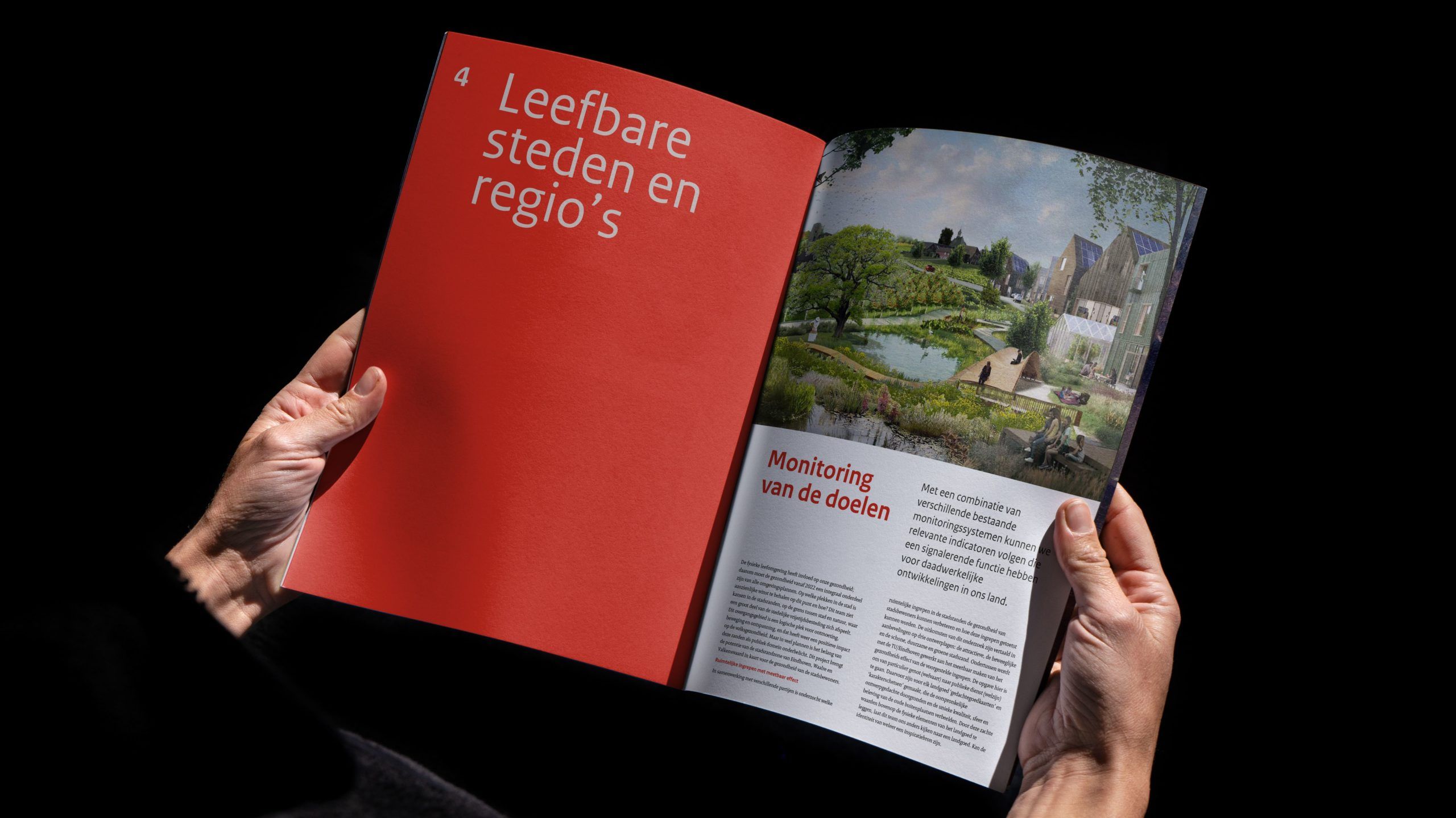
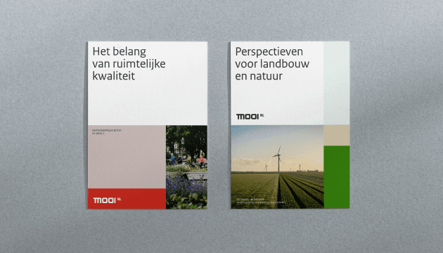
Mooi NL is a program in which many challenges come together. There are 12 main themes alone. It is therefore important to clarify complicated matters and to stimulate optimism among all parties involved. The starting point for the visual language we designed is therefore progress. You see this shifting movement coming back in the designs.
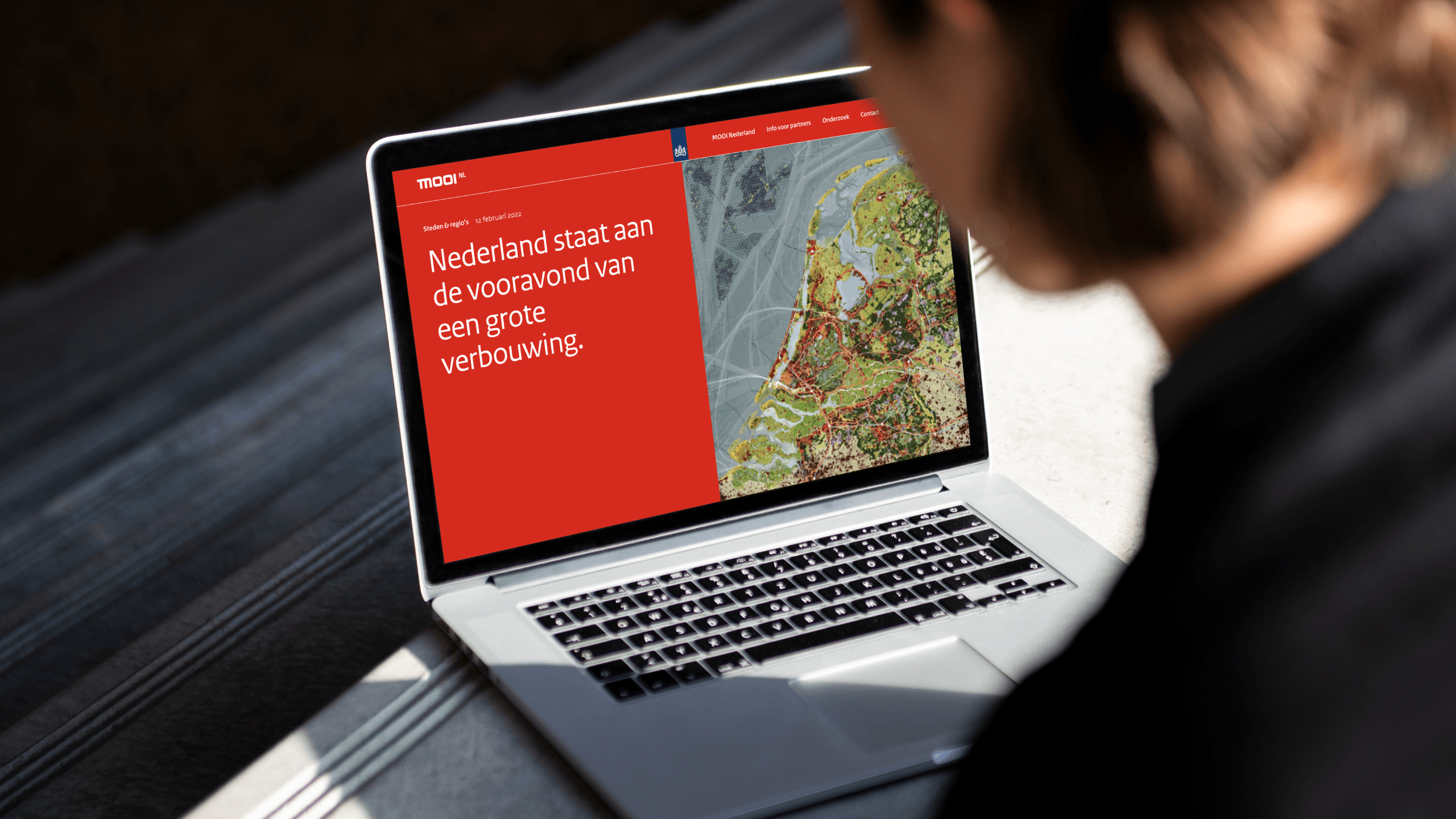
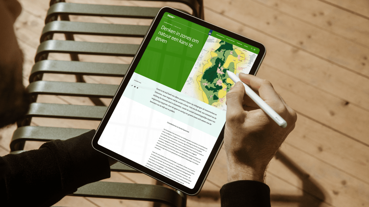
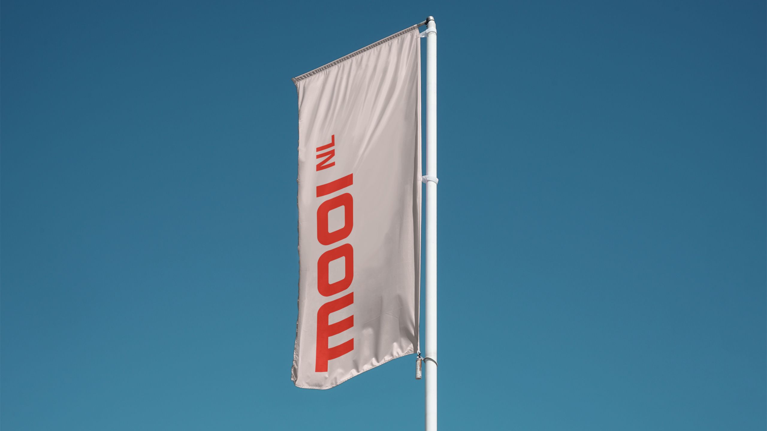
We developed a visual style, logo and icons in which we had to take the branding of the Rijksoverheid (central government). Think of a fixed color palette and typography.
It's always interesting to take on the challenge of infusing new energy into such an established brand like Rijksoverheid. By using only the brand's core elements, we were able to build a creative solution that showcases the program's potential for innovation and originality.
A sustainable design to appeal to new target groups again and again
As you can sense, a program that is about designing the Netherlands won’t be finished anytime soon. The project will have several phases and will have to involve new target groups every time. It starts with cultivating support from governments – provinces, other ministries – and partners and will ultimately extend to society as a whole.
That makes it important that the visual style works in the long term. Not trendy, but really well designed. Flexibility of style is important for this. Because of course you always need something different in communication in different phases, for different target groups and in different contexts. We solved this effectively by making the design function as a framework. That framework is rock solid, but you can charge it differently by, for example, adding other colors or images or adjusting the tone-of-voice of the texts. In this way, the design changes with the phases in the project, but it still remains recognizable.
Fool proof design system to guarantee consistency
Do you know how many government officials have to prepare presentations or documents with this design? That’s a recipe for a watered-down style that loses impact. To guarantee visual uniformity, we developed a clear design system that is easy to work with. Even if you have no background or talent for design. Everything is designed on a grid and easy to apply. In this way, the style continues to radiate movement in any case.
This project has everything we are good at: a strategic design for the long term, on a social theme for the long term.
World Benchmarking Alliance
Achieving sustainable development goals with a powerful design and development system