Know which buttons to turn for business success (part 2)
Okay, recap. In part 1 we found that:
- The satisfying principle applies not only to consumers but also to business buyers. Weinberg and Lombardo recently proved this.
- This means that Byron Sharp’s teachings on mental and physical availability are also fully applicable to the business market.
- And that business marketers could focus much more on emotion and less on rationality
- Now for the practical tips
In short, as a brand you want to be top of mind when your customer is ready to decide. Whether you are attractive as a brand is largely determined by brand assets, Byron Sharp shows.
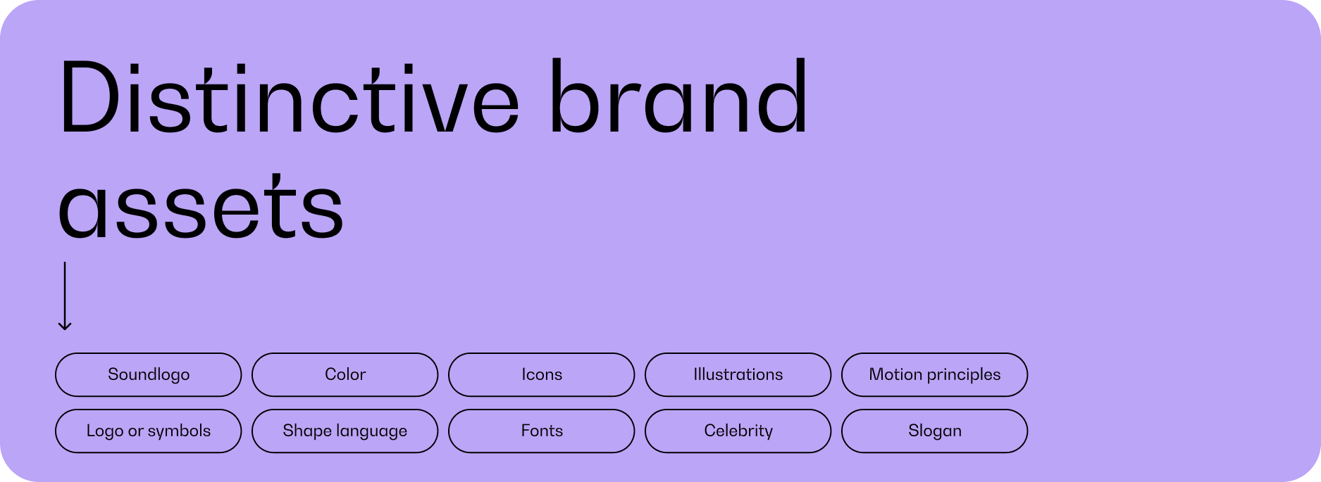
Brand assets in your marketing
A brand asset is a distinctive visual or auditory cue that activates the brand in your brain. This can be the logo, the color scheme, the font, a shape, jingle, slogan, tone-of-voice, a mascot, an ambassador, you get it…
The purpose of a brand asset is twofold: it must ensure that your potential customer understands what kind of brand it is, but also that it stands out enough. As a marketeer, you can experiment with the ideal balance between recognisability and distinctiveness.

Do you sell milk or solar panels?
Firstly, it is super important that your potential customers understand what you will offer as a brand. If you, as a bicycle repair shop, resemble a hip coffee bar in terms of branding, you will probably mainly get people coming in for a flat white with oat milk, and people with a flat tire will walk right past. That’s no good!
Recognition is therefore something that B2B marketers often rely heavily on. The marketeers – supported by digital agencies – often seem to look at the best practices within a certain category (i.e. what works with your competitors) and you develop your own marketing accordingly. That sounds like a smart plan. Why set aside a budget for innovative branding when you can also focus on what has already proven itself? Yet herein lies the danger: if your branding is too uniform, it won’t really help you conquer that place in the mind of your potential customer.
So you want to be recognizable enough so that people put your brand in the right box (yes, this is one of the few times that you want that), but with striking features of its own so as not to be overlooked as one-of-a-kind.
Nice to stand out
While many digital agencies copy best practices and focus on technical details, design agencies use all their creative tricks to make the brand stand out. And they can pass on that. It seems cool when you get a whole brand book full of options for your branding after a design process. With a palette of no less than 15 brand colors with which the organization can then ‘play with’. Or even more absurd, that the logo itself no longer has a fixed shape, but can be ‘used creatively’. But it is not always clear to the marketeer how to build a recognizable brand with all those options and colors. Because this bag of design tricks shoots in all directions.

And then there are cases where you don’t really know what kind of brand you are looking at anymore, because they are too distinctive from the category. For example, after a rebranding, Dropbox suddenly looked more like a fashion brand, and lost the ‘simple’ association that had contributed to the success of the brand. A rebranding that they have now largely reversed in order to be recognizable as a software company again.
Determine your balance as a B2B marketeer
In order to arrive at a branding that appeals and is remembered, the trick is to find exactly the right balance between recognition and distinctiveness. As GRRR, that’s something we pay a lot of attention to. Think of it as playing with the sliders on a mixing panel: which elements do you use to join the category and which brand asset can open fully to make your brand stand out. One element can be enough to convey a feeling about your brand.
So this is what you can do:
- Know the core values of your brand: do you have a clear idea of what story and what feeling you want to convey to your target group?
- Review your brand assets. Which brand assets convey that feeling best? And how can you fully exploit it?
Distinguish your brand visually
You could choose a strong image to enter into that emotional connection with your target group. Museum Voorlinden does this by repeatedly showing the photogenic artwork Swimming Pool by Leandro Erlich in their communication. Often in a photo with a family or children in it, which emphasizes what a nice museum it is to visit with your family. This image is repeated by their visitors in countless insta posts.

Growing recognition with colors
Not every brand is so photogenic (or has a giant bathtub in its office). Then it may be more appropriate to choose a bright color combination or a shape element. If you repeat a clear choice for a color, font and/or shapes over and over (without literally duplicating the image) it builds recognition.
But it is also possible that you do not need a visually distinctive style because your story or service is unique. Then all attention can go there and it is important that the visual part does not overwhelm this. This is the strategy we have chosen in our work for The Ocean Cleanup. Where the design is in line with the category of tech companies – blue, minimalist typography, many technical drawings – we focus all attention on the unique story of The Ocean Cleanup. That story – told by founder Boyan Slat – is really the distinguishing element of The Ocean Cleanup. The fact that they are tackling the plastic soup with new technology is repeatedly over and over again in the communication. This is how the value of The Ocean Cleanup really comes into its own.
Long story short: B2B brands don't have to be boring
In fact, it’s a shame not to twinkle with brand magic here. Because yes, professionals are also people of flesh and blood, who also in the evening on the couch just shed a tear when seeing the first steps of their nephew.